
Saturday, 8 February 2020
Own work: Collage
I have a new collage to share with you. Finished just a few minutes ago. 22.7 x 25.2 cms on 300 gsm watercolour paper.


Own work: from my sketch book
Thought I'd briefly share this drawing I did the other week of one of the trees at the back of our house - inspired by the tree studies of John Constable and Samuel Palmer. I find the form and shape of trees deeply fascinating particularly in winter where they are empty of leaves; I also like the sound they make in the wind. Like the sea. However I've always held back from drawing one feeling my skills weren't up to snuff and I have to admit it was a tricky thing, loosing my way a few times, but over all I would count it as a success.


Thursday, 6 February 2020
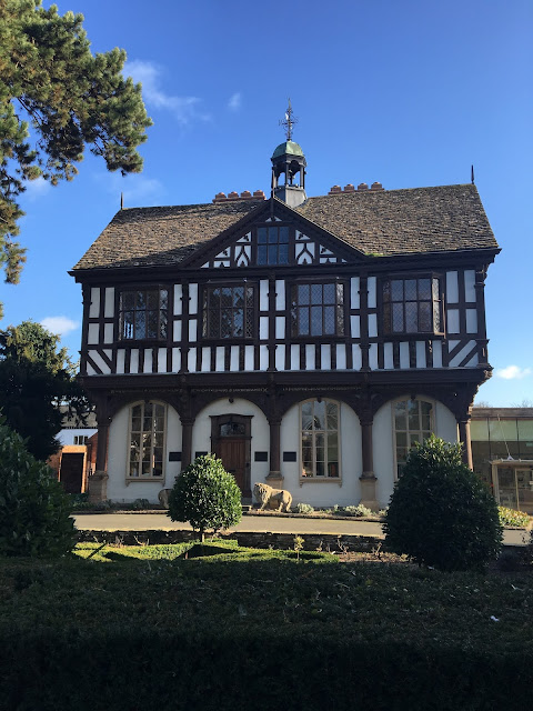
Grange Court, Leominster
It really was a flying visit. We didn't pay enough attention to the town in our determination to get to the Priory. But we did see we really liked and we will return.
One building, however, really did attract our gaze: the rather jaunty Grange Court standing neat and trim behind an equally neat and trim garden near the church. This was originally the Butter Cross and stood in the town centre at the junction of High St and Broad St until sometime in the 19th century when it was dismantled and moved to its current, somewhat genteel location becoming a private residence. Originally the ground floor was open to the elements. It is the work of John Abel of Hereford, the King's Carpenter, and dates from 1633. We've come across his work before in my post about Dore Abbey.

Tuesday, 4 February 2020
Leominster Priory
Without a doubt this is a monster of a church. Perhaps not that big in the scheme of things - it is roughly 100 x125 ft - but there is something sublime about what is in fact merely the fragment of a larger medieval priory. It has to be said that is quite the experience to step into this building with all its complexity and seeming vastness. The scale is big, and very often powerful, almost primitive. At times verging on the sublime. At first it is difficult to comprehend, this is not a building that is at all lucid or coherent, and it is only as you walk around and it continues to open up to you is understanding achieved. A building to be apprehended first emotionally rather than intellectually, I think. Well, I suppose that could be applied to all buildings and in particular medieval churches where there is an attempt to embody mystery in the material. Only more so at Leominster where one is unprepared for the unexpectedness of it all, for what one encounters is really two interconnecting churches: a massive, and austere, early Norman priory nave and N Aisle, and in startling contrast to the S a vast parochial space divided into nave and s aisle (or is it two aisles?) by an elegant and daring arcade which is the work of George Gilbert Scott Sn in the 1870s. It replaces an arcade of Tuscan columns (the stoutest of the Classical orders) that in turn replaced the arcade destroyed in a fire in 1699. I would think Scott based his design on some surviving evidence, but even if he didn't it's a coup de theatre that easily justifies its presence. Bar the spectacular and vast Perp w window all the rest in this part of the church is early Decorated, in the style we have met before in the N transept of Ledbury church. There is plenty of ballflower here too both inside and out.
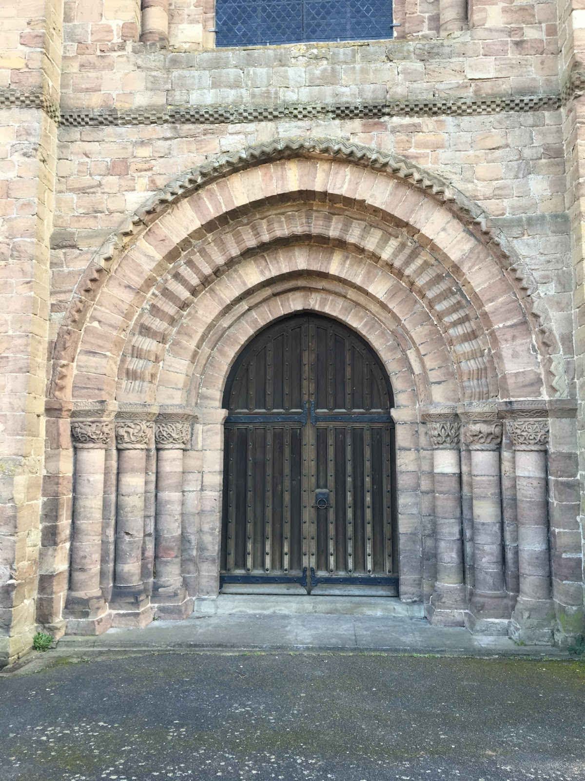
The best sculpture is, however outside, where the late Norman w door survives in all its massive and barbaric splendour. The six capitals are fine examples of the Herefordshire school of Romanesque sculptors, blending late Antique and 'Barbarian' northern European elements. The two outer capitals are the most classical: on the right hand-side there is a form of 'running palmette', and the left 'Inhabited Vinescroll'. This latter is a symbol both of paradise and the church (which in worship is a foretaste of heaven, or should be). The other four capitals are definitely more northern in inspiration and the symbolism a little obscure in places. The easiest to understand is the centre left which two husbandmen pruning vines. The vine is both a symbol of Christ and the church (which is both his body and his bride) see John 14: 1-15. As Christians we are all grafted into the vine, i.e. the Body of Christ, and sometimes pruned away - this is what the capital depicts. Both this capital and the one to its left, the 'Inhabited Vinescroll' are Eucharistic symbols. It is also possible to see both column shafts as Christ himself. I think, while I'm about it, I'll also suggest that the two inner columns represent the Tree of the Knowledge of Good and Evil (left) and the Tree of Life (right). The left inner column may also represent the Brazen Serpent erected by Moses see Numbers 21: 4-9, a type of the Crucifixion of Christ see John 3: 14-16.
In all great architecture, but there are no fittings of note, sadly. And those present are lost in the vastness. A lot of money would need to be spent in creating something that could hold its own here with any confidence. The only thing to stay in my mind is the picture hanging above the south porch - one part of a reredos perhaps? Alas there is far too much clutter, and I hate the re-ordering. Not a church I think I would happily worship in.


The best sculpture is, however outside, where the late Norman w door survives in all its massive and barbaric splendour. The six capitals are fine examples of the Herefordshire school of Romanesque sculptors, blending late Antique and 'Barbarian' northern European elements. The two outer capitals are the most classical: on the right hand-side there is a form of 'running palmette', and the left 'Inhabited Vinescroll'. This latter is a symbol both of paradise and the church (which in worship is a foretaste of heaven, or should be). The other four capitals are definitely more northern in inspiration and the symbolism a little obscure in places. The easiest to understand is the centre left which two husbandmen pruning vines. The vine is both a symbol of Christ and the church (which is both his body and his bride) see John 14: 1-15. As Christians we are all grafted into the vine, i.e. the Body of Christ, and sometimes pruned away - this is what the capital depicts. Both this capital and the one to its left, the 'Inhabited Vinescroll' are Eucharistic symbols. It is also possible to see both column shafts as Christ himself. I think, while I'm about it, I'll also suggest that the two inner columns represent the Tree of the Knowledge of Good and Evil (left) and the Tree of Life (right). The left inner column may also represent the Brazen Serpent erected by Moses see Numbers 21: 4-9, a type of the Crucifixion of Christ see John 3: 14-16.
In all great architecture, but there are no fittings of note, sadly. And those present are lost in the vastness. A lot of money would need to be spent in creating something that could hold its own here with any confidence. The only thing to stay in my mind is the picture hanging above the south porch - one part of a reredos perhaps? Alas there is far too much clutter, and I hate the re-ordering. Not a church I think I would happily worship in.




Friday, 24 January 2020
Exhibitions at Aberglasney
I was delighted to be asked to contribute some work to the current group exhibition at Aberglasney, the wonderful gardens near between Llandeilo and Carmarthen. On Monday, a day of fog and mist and cold dampness, Manon (who is in charge of exhibitions and events at Aberglasney) and I spent the morning hanging the work. It was great working with her - lovely to talk about art with a fellow enthusiast. The show closes at the end of February.
Anyway I thought take this opportunity to tell you that my next solo show, which will also be at Aberglasney, will be in less than four months time: 22.05.20 - 28.05.20.


Afterwards I had a wander around. It was all very atmospheric, especially up around the church which looked as though it was a setting for one of the BBC's 1970s adaptation of M R James.


Anyway I thought take this opportunity to tell you that my next solo show, which will also be at Aberglasney, will be in less than four months time: 22.05.20 - 28.05.20.


Afterwards I had a wander around. It was all very atmospheric, especially up around the church which looked as though it was a setting for one of the BBC's 1970s adaptation of M R James.


Sunday, 19 January 2020
The Princes Fountain, Oystermouth
It's been a bright crisp weekend here. So yesterday I took the opportunity and popped down to the Oystermouth, that conglomeration of suburb and holiday resort at the extreme sw corner of Swansea Bay collectively known as Mumbles.
It's a lovely discrete sort of place, with nothing too flashy; mainly Victorian, though the parish church, which I have already blogged about, is much earlier, with villas, cottage ornees, and any number of terraces both grand and commonplace - penny plain and tuppence coloured. I suspect however that economic pressures are beginning to mount - M & S is opening a shop there at the end of the month and it may have a detrimental effect on the local small businesses. It certainly would be a shame if it led to the homogenisation of the local High St - after all it has a fishmongers and two each of the following: greengrocer, butcher, independent wine merchant, and also a very good ironmongers.
Anyway I was a man on a mission for nestling away on a street corner is The Princess Fountain, and I was after some research. I discovered it a year ago as I was having an explore, and it's been hovering around in my mind demanding to be painted. So there I was camera in hand attracting the interest of at least one local. It's a rather accomplished design, small but monumental. Delightful and full of presence. It dates from the 1860s and is therefore a late, very late, example of Neo-classicism.


Thursday, 16 January 2020
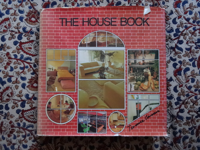
The House Book I
Well, I've been meaning to write a post about this book for a long time, and by 'a long time' I mean 5 years....since when on our holiday in Norfolk I found 'The House Book' in the secondhand bookshop run by the Bure Valley Railway at their station in Wroxham. It was a book I had been looking for for some time. It is hefty tome, choc full of photographs of then contemporary interiors. A surfeit of images and ideas. And that is one of this book's fascinations; it makes for an excellent record of British middle class taste in interior design in the late Sixties and early seventies. (London centred at that.) And it is heady stuff, bold and intense. Confident. A startling contrast too to the prevailing sense of failure and dissolution that began to swamp Britain at the time. I find it a perennial inspiration, and have given copies of it as gifts to those I know who are setting up home.
But I'm getting ahead of myself here.
This encyclopaedic, heavyweight tome was published by Mitchell Beazley in 1974, and it bears the imprimatur of Terence Conran, though how much of the text is actually by him is open to question - there is a long list of contributors at the beginning. Perhaps it is best seen as a collaborative effort of a team of writers and designers in the Conran orbit - the design of the book, for instance, was not the work of the publishers but 'in-house' at Conran Associates. Stafford Cliff, also the Art Director of the Habitat catalogue in the 1970s, was the designer.
But I'm getting ahead of myself here.
This encyclopaedic, heavyweight tome was published by Mitchell Beazley in 1974, and it bears the imprimatur of Terence Conran, though how much of the text is actually by him is open to question - there is a long list of contributors at the beginning. Perhaps it is best seen as a collaborative effort of a team of writers and designers in the Conran orbit - the design of the book, for instance, was not the work of the publishers but 'in-house' at Conran Associates. Stafford Cliff, also the Art Director of the Habitat catalogue in the 1970s, was the designer.
Whatever the truth, 'The House Book' was one of the ways that Conran became known as was one of the major arbiters, and shapers, of Post-War Middle Class taste in Britain. And I think it was a very bourgeois project for all the talk of the democratisation. Conran is rather like the British cookery writer Delia Smith in that they are both interpreters, and indeed re-packagers, of high style to the new (and therefore uncertain) Middle Classes. (What this meant in effect was they took the ideas of, say, the British cookery writer Elizabeth David (1913-1992) and made them accessible.) Both Conran and Smith therefore stand in the tradition of Mrs Beeton the famous nineteenth century cookery writer, that exhaustive guide for the newly bourgeois.
Anyway what Conran did in the terms of retail, i.e. Habitat which he founded in 1964, was all very aspirational. All those room sets in 1970s Habitat catalogues craftily contained the element of unattainability - yes, of course one could easily buy the furniture etc, but the rooms invariably contained decorative elements that were not so easily affordable or available. Things, one might argue, that were only available to the metropolitan initiate. It was all very clever - simultaneously to satisfy and feed the desire. To leave the consumer oh so hungry - eternally hungry, eternally insecure - for more. Consumerism as way of achieving group identity.
Well, The House Book is, thankfully, rather less hard sell than that. One could call it neutral in that respect, though one suspects plenty of Conran design projects on display. It is also deeply practical, as well as frankly beautiful. (I always feel that one of the major influences on Conran is that French art of living - L'Art de Vivre, that is such a joy and fascination in French literature.) There are sections on all sorts of things you need to know to run a house well, but perhaps the most telling section is at the beginning of the book when the uncertain amongst us are taken gently by the hand and given six design templates to follow: 'Farmhouse', 'Townhouse',' Country House', 'Mediterranean', 'International' and 'Eclectic'. Six consumer choices, six items from the dressing up box. Anyway the book is full of images of work by any number of favourites of this blog: Geoffrey Bennison, David Hicks, Mary Gilliatt, David Hockney and his assistant Mo McDermot, and Alvilde Lees Milne. Anyway enough said - here are twelve images for your delectation and delight. More to follow.


Well, The House Book is, thankfully, rather less hard sell than that. One could call it neutral in that respect, though one suspects plenty of Conran design projects on display. It is also deeply practical, as well as frankly beautiful. (I always feel that one of the major influences on Conran is that French art of living - L'Art de Vivre, that is such a joy and fascination in French literature.) There are sections on all sorts of things you need to know to run a house well, but perhaps the most telling section is at the beginning of the book when the uncertain amongst us are taken gently by the hand and given six design templates to follow: 'Farmhouse', 'Townhouse',' Country House', 'Mediterranean', 'International' and 'Eclectic'. Six consumer choices, six items from the dressing up box. Anyway the book is full of images of work by any number of favourites of this blog: Geoffrey Bennison, David Hicks, Mary Gilliatt, David Hockney and his assistant Mo McDermot, and Alvilde Lees Milne. Anyway enough said - here are twelve images for your delectation and delight. More to follow.


Subscribe to:
Posts (Atom)