
Showing posts with label Neo-Romanticism. Show all posts
Showing posts with label Neo-Romanticism. Show all posts
Thursday, 17 May 2018
Own work: The Baptist Chapel, Bourne
Here is something I prepared earlier when I was in a very John Piper mood. It's of the Baptist Chapel in west St Bourne, Lincolnshire. It is a rather powerful piece of architecture and I've always been inclined to credit Bryan Browning, beloved of this parish, with the design. I have no documentary evidence for this, unhappily. I've asked at the chapel a couple of times but nobody had a clue. I did the painting Wednesday and it probably took about three hours - perhaps less. Thankfully less than half that time was actually spend siting in the cold drawing. Mixed media - pen and ink, watercolour, gouache oil pastel over pencil underdrawing on Acid free, Archival, 300gsm watercolour paper. The most Piperesque thing I've done to date.


Wednesday, 14 June 2017
Own work
A painting expedition this morning, the first in a while. The destination was St Michael Langtoft and the lovely classical south porch. The Buildings of England says 18th century - I wonder if it's not earlier than that. Charming all the same. The usual mixed media.


Sunday, 12 March 2017
The Hard-won Image: Paul Nash at Tate Britain
In the first, dark room there were trees. Lots of them lining the walls. I was standing in the Paul Nash exhibition in Tate Britain, just over a week ago and it was very crowded - very popular, and a little oppressive. But then it was a Saturday afternoon. And on the walls are a series of mainly watercolours, mainly of trees. The types of trees are clearly articulated. Figures are rare and those there are seem somewhat awkward. There is a general tightness of technique. It is very pastoral and delicate. And there the main themes of Nash's work are established. He remained faithful to them throughout his working career.
Even in the the second room, where the contrast in subject matter and technique could not be greater, the themes remain. This is the first of two rooms dedicated to Nash's response to conflict. In this case World War I. The work on display is on a far greater scale to that first room, the medium is now oil. That particular change seems to have come out of the blue. There is a sense of place and there are trees too, blasted and shattered things. These are not images so much of a world shattered by mechanized warfare, but a world denuded of meaning, shorn of immanence. Victim, perhaps of Modernity itself.
Nash (1889 - 1945) is credited with being among the first Neo-Romantic artists. Neo-Romanticism is a rather nebulous grouping of 20th century British artists - there was never such a thing as a manifesto - but what they did do was combine Romantic sensibility with elements, such as the visual language, of European Modern Art. Neither does it share the formalism of the Bloomsbury group such as Roger Fry, for it is an art of place, sensibility and ideas. And, I think, Nash is first and foremost an intellectual artist. And one, I suspect, for whom the image is hard-won. There is an almost utilitarian quality of the painted surface, none of the sensuality of paint one would associate with an older contemporary such as Singer Sergeant or Lavery. Although the work he produced in the high intensity of WWI is influenced by the Vorticists, which, I suppose, represents the high point of British Modernism, his interests, and his aims, are essentially different from theirs. Nash's attitude to Modernity, like those of the other Neo-Romantics, was ambiguous. And this, it can be argued separates the Neo-Romantics in general from European Modernism.
Even in the the second room, where the contrast in subject matter and technique could not be greater, the themes remain. This is the first of two rooms dedicated to Nash's response to conflict. In this case World War I. The work on display is on a far greater scale to that first room, the medium is now oil. That particular change seems to have come out of the blue. There is a sense of place and there are trees too, blasted and shattered things. These are not images so much of a world shattered by mechanized warfare, but a world denuded of meaning, shorn of immanence. Victim, perhaps of Modernity itself.
Nash (1889 - 1945) is credited with being among the first Neo-Romantic artists. Neo-Romanticism is a rather nebulous grouping of 20th century British artists - there was never such a thing as a manifesto - but what they did do was combine Romantic sensibility with elements, such as the visual language, of European Modern Art. Neither does it share the formalism of the Bloomsbury group such as Roger Fry, for it is an art of place, sensibility and ideas. And, I think, Nash is first and foremost an intellectual artist. And one, I suspect, for whom the image is hard-won. There is an almost utilitarian quality of the painted surface, none of the sensuality of paint one would associate with an older contemporary such as Singer Sergeant or Lavery. Although the work he produced in the high intensity of WWI is influenced by the Vorticists, which, I suppose, represents the high point of British Modernism, his interests, and his aims, are essentially different from theirs. Nash's attitude to Modernity, like those of the other Neo-Romantics, was ambiguous. And this, it can be argued separates the Neo-Romantics in general from European Modernism.
I would also argue that it was the two great cataclysmic conflicts of the twentieth century, WWI & WWII, that (partially, at least) released Nash from the tightness of technique and awkwardness of composition I mentioned above. A change forced upon him by the exigency of putting oil on canvas at a time of emotional turmoil.
Pictures of Nash seem to show a large robust man with a face like a Hanoverian monarch. These images belie the truth that Nash's health was seldom good and the effect on him of the battle fields of the Western Front was traumatic. To recover he buried himself in nature, in place, and the work of this post-war period we see the growing influence of European Modernism. Perhaps my favourite work of this period is 'Wood upon the Downs', a work of strange mystery. Nash seems to have absorbed any number of, sometime contradictory, influences - Cezanne, de Chirico; and I think it telling that of all those influences the most important to act upon Nash was that of the Surrealists, an art of the mind if ever there was. The art of this period was on the whole new to me. I found the interiors and the assemblages of found images the most intriguing. But still Nash was, like British art itself has continued to be throughout the 20th century, obsessed with both place and object - the extraneous subject to the canvas. Nash's interest in contemporary Modernism perhaps was partly utilitarian in that it provided him with a language in which he could explore certain themes both intellectually and emotionally upon the canvas.
In the final two rooms (there are six in all), the rooms dedicated to work Nash produced in the last five years of his life, there is some of the most moving and a times radiant work produced in the last century by any British artist. 'Totes Meer' of 1940-1, with its great swelling sea of crashed German aircraft, is truly outstanding work of deep emotional impact and resonance, but it those last landscapes painted when he was to all intents and purposes dying and was living in Oxford, that all those influences and interest reach a synthesis which of all his work seems the most effortless. In these final works he returned to one of the places and subjects of the early works of that first room of the exhibition, the Wittenham Clumps - a group of trees that sprout from a couple of hills on the southern edge of the Thames Valley on the Berkshire/Oxfordshire border. A place rich in cultural and historical resonances. Nash first visited them in 1911, and said that they were of a 'beautiful legendary country haunted by old gods long forgotten'. I think the same could be said for his art.
Pictures of Nash seem to show a large robust man with a face like a Hanoverian monarch. These images belie the truth that Nash's health was seldom good and the effect on him of the battle fields of the Western Front was traumatic. To recover he buried himself in nature, in place, and the work of this post-war period we see the growing influence of European Modernism. Perhaps my favourite work of this period is 'Wood upon the Downs', a work of strange mystery. Nash seems to have absorbed any number of, sometime contradictory, influences - Cezanne, de Chirico; and I think it telling that of all those influences the most important to act upon Nash was that of the Surrealists, an art of the mind if ever there was. The art of this period was on the whole new to me. I found the interiors and the assemblages of found images the most intriguing. But still Nash was, like British art itself has continued to be throughout the 20th century, obsessed with both place and object - the extraneous subject to the canvas. Nash's interest in contemporary Modernism perhaps was partly utilitarian in that it provided him with a language in which he could explore certain themes both intellectually and emotionally upon the canvas.
In the final two rooms (there are six in all), the rooms dedicated to work Nash produced in the last five years of his life, there is some of the most moving and a times radiant work produced in the last century by any British artist. 'Totes Meer' of 1940-1, with its great swelling sea of crashed German aircraft, is truly outstanding work of deep emotional impact and resonance, but it those last landscapes painted when he was to all intents and purposes dying and was living in Oxford, that all those influences and interest reach a synthesis which of all his work seems the most effortless. In these final works he returned to one of the places and subjects of the early works of that first room of the exhibition, the Wittenham Clumps - a group of trees that sprout from a couple of hills on the southern edge of the Thames Valley on the Berkshire/Oxfordshire border. A place rich in cultural and historical resonances. Nash first visited them in 1911, and said that they were of a 'beautiful legendary country haunted by old gods long forgotten'. I think the same could be said for his art.
Sunday, 29 May 2016
Own work: St Firmin, Thurlby, Lincolnshire
A sketch I made last week of the tower of St Firmin's church, Thurlby. Ink, watercolour and oil pastel on mould-made 100% cotton 300g watercolour paper. Saxo-Norman tower with Perp bell chamber and spire.


Monday, 7 October 2013
Alan Sorrell Part III 'Saxon England'
I had made plans to write this post a few weeks ago, but my attention was diverted by clearing out my late Aunt's flat - an deeply emotional experience that is still sending out it's little ripples of sadness.
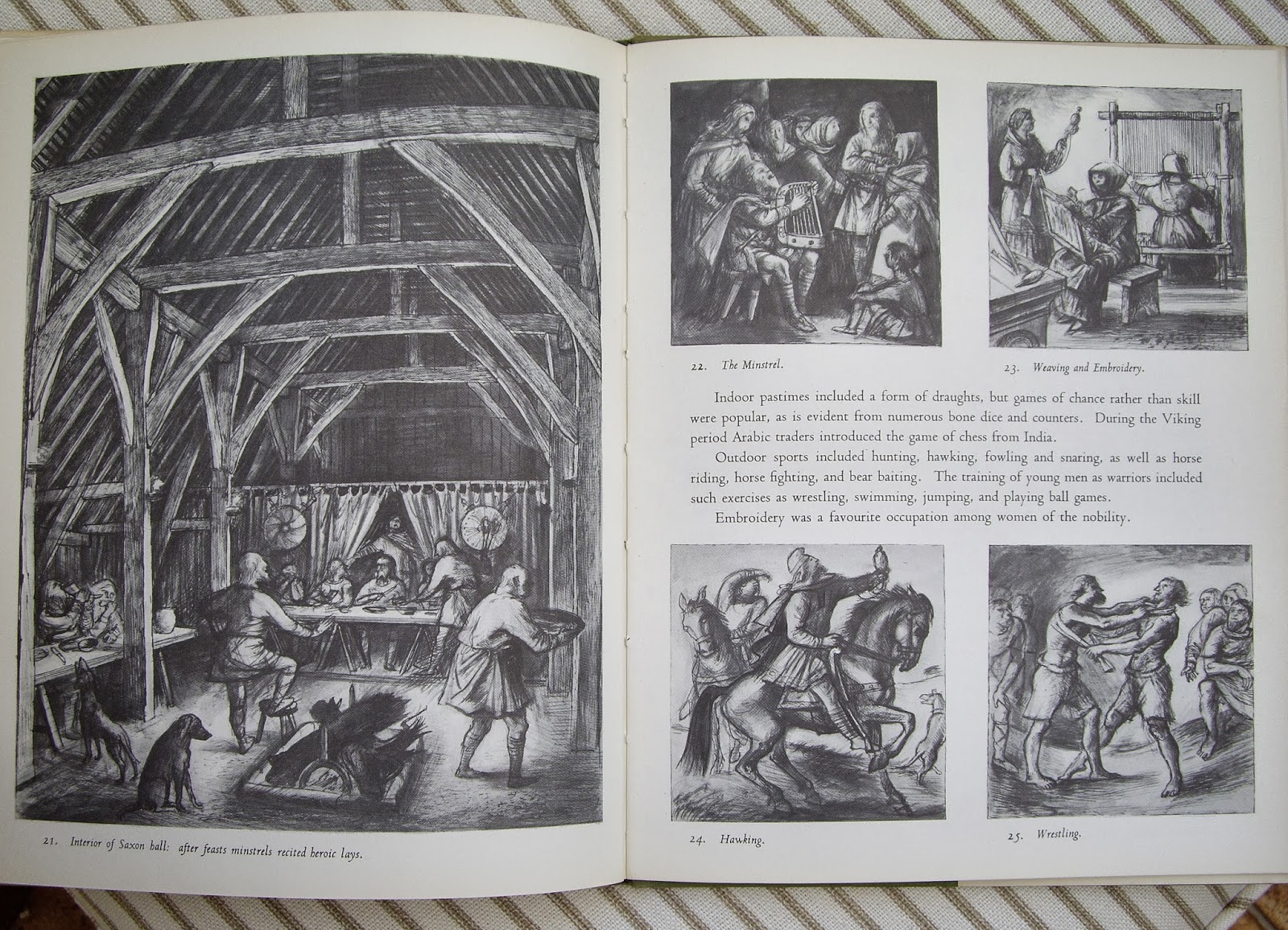
So here, somewhat delayed, is the third in my occasional series on the work of the artist and illustrator Alan Sorrell. This is an book in the series he illustrated for the Lutterworth Press. His collaborator this time was the archaeologist John Hamilton. The cover is certainly brighter than the one he drew for 'Roman Britain'. There is something in the quality of both colour and drawing that reminds me of the work of Pauline Baynes (1922-2008) - the illustrator of, amongst other things, 'The Chronicles of Narnia' published by Geoffrey Bles.) The most Neo-Romantic illustration is that of a Celtic monastery, a composition that seems to echo a lithograph by John Piper. That brings me briefly on to the slightly unsuitable title, perhaps 'Dark Age Britain' would have been more appropriate for a book that covers all of these isles.


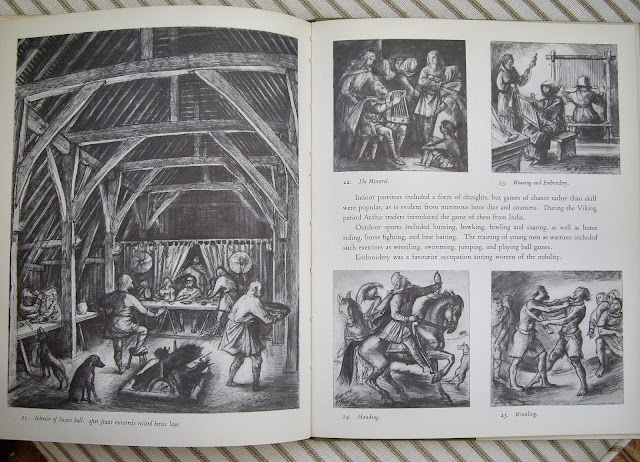


So here, somewhat delayed, is the third in my occasional series on the work of the artist and illustrator Alan Sorrell. This is an book in the series he illustrated for the Lutterworth Press. His collaborator this time was the archaeologist John Hamilton. The cover is certainly brighter than the one he drew for 'Roman Britain'. There is something in the quality of both colour and drawing that reminds me of the work of Pauline Baynes (1922-2008) - the illustrator of, amongst other things, 'The Chronicles of Narnia' published by Geoffrey Bles.) The most Neo-Romantic illustration is that of a Celtic monastery, a composition that seems to echo a lithograph by John Piper. That brings me briefly on to the slightly unsuitable title, perhaps 'Dark Age Britain' would have been more appropriate for a book that covers all of these isles.




Monday, 25 March 2013
Alan Sorrell Part II 'Roman Britain'
This was one of the books illustrated by Alan Sorrell that I came across in our local library as a child.


Saturday, 16 February 2013
Some more work


The top image was first I worked on (from a sketch on a shopping list). The lower image is full sized sketch based on the first and further ideas I played with in a note book.
Monday, 27 April 2009
1st Posted Drawing

St Erkenwald
Today I thought I'd post one of my drawings: a fine piece of English Baroque (Talman) - mutlimedia (pen, coloured pencil and wax pastel). I hope you like it. It was produced on my (as yet) only trip to Lancashire.
Addendum 30th May 2014. It's actually Stonyhurst.
Addendum 30th May 2014. It's actually Stonyhurst.
Subscribe to:
Posts (Atom)