Showing posts with label 'The House Book'. Show all posts

Monday, 30 March 2020

The House Book II

      I know I'm repeating myself here but the strength of the interiors shown in The House Book is their confidence.  Their creators may sometimes miss the mark but they are not afraid of failure. Colourful, bold, experimental they are expressions of the personality, and perhaps even the subconscious, of the owner.  And for that they are to be applauded.
      Today - what a sorry contrast - we are timid. Bland. I may have used this analogy before but Goodhart Rendell, writing about the Late Gothic Revival followers of G F Bodley coined the phrase 'The wages of good taste is death' (cf Romans 6. 23) to describe their attenuated churches. (A little harsh, perhaps) The same could be applied to too much of today's interiors. It is all too reasonable. What are we so scared of? Are we so characterless? Unformed?
     I suppose that some of the blame can be placed with property programmes on tv as though we all should live permanently in blank canvas mode in case we should suddenly want to sell up and move. All far too corporate for me. The whole thing exemplified by C4's 'Grand Designs', where houses look like public buildings rather than homes; Dolly Parton once said, "It takes a lot of money to look this cheap," and 'Grand Designs' shows it certainly takes a lot of money to look that bland, that characterless. Happily I think things really are beginning to change for the better. Colour, at least, is returning.
     Anyway here is a second selection of interiors and/or images that caught my eye; the first image is actually the Conran's kitchen from when they lived in one of those spectacularly theatrical terraces that fringe Regent's Park in London.


Thursday, 16 January 2020

The House Book I

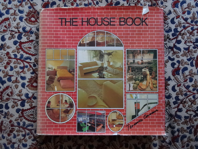
     Well, I've been meaning to write a post about this book for a long time, and by 'a long time' I mean 5 years....since when on our holiday in Norfolk I found 'The House Book' in the secondhand bookshop run by the Bure Valley Railway at their station in Wroxham. It was a book I had been looking for for some time. It is hefty tome, choc full of photographs of then contemporary interiors. A surfeit of images and ideas. And that is one of this book's fascinations; it makes for an excellent record of British middle class taste in interior design in the late Sixties and early seventies. (London centred at that.) And it is heady stuff, bold and intense. Confident. A startling contrast too to the prevailing sense of failure and dissolution that began to swamp Britain at the time. I find it a perennial inspiration, and have given copies of it as gifts to those I know who are setting up home.

     But I'm getting ahead of myself here.

     This encyclopaedic, heavyweight tome was published by Mitchell Beazley in 1974, and it bears the imprimatur of Terence Conran, though how much of the text is actually by him is open to question - there is a long list of contributors at the beginning. Perhaps it is best seen as a collaborative effort of a team of writers and designers in the Conran orbit - the design of the book, for instance, was not the work of the publishers but 'in-house' at Conran Associates.  Stafford Cliff, also the Art Director of the Habitat catalogue in the 1970s, was the designer.
     Whatever the truth, 'The House Book' was one of the ways that Conran became known as was one of the major arbiters, and shapers, of Post-War Middle Class taste in Britain. And I think it was a very bourgeois project for all the talk of the democratisation. Conran is rather like the British cookery writer Delia Smith in that they are both interpreters, and indeed re-packagers, of high style to the new (and therefore uncertain) Middle Classes. (What this meant in effect was they took the ideas of, say, the British cookery writer Elizabeth David (1913-1992) and made them accessible.) Both Conran and Smith therefore stand in the tradition of Mrs Beeton the famous nineteenth century cookery writer, that exhaustive guide for the newly bourgeois. 
     Anyway what Conran did in the terms of retail, i.e. Habitat which he founded in 1964, was all very aspirational. All those room sets in 1970s Habitat catalogues craftily contained the element of unattainability - yes, of course one could easily buy the furniture etc, but the rooms invariably contained decorative elements that were not so easily affordable or available. Things, one might argue, that were only available to the metropolitan initiate. It was all very clever - simultaneously to satisfy and feed the desire. To leave the consumer oh so hungry - eternally hungry, eternally insecure - for more. Consumerism as way of achieving group identity.

      Well, The House Book is, thankfully, rather less hard sell than that. One could call it neutral in that respect, though one suspects plenty of Conran design projects on display. It is also deeply practical, as well as frankly beautiful. (I always feel that one of the major influences on Conran is that French art of living - L'Art de Vivre, that is such a joy and fascination in French literature.) There are sections on all sorts of things you need to know to run a house well, but perhaps the most telling section is at the beginning of the book when the uncertain amongst us are taken gently by the hand and given six design templates to follow: 'Farmhouse', 'Townhouse',' Country House', 'Mediterranean', 'International' and 'Eclectic'. Six consumer choices, six items from the dressing up box. Anyway the book is full of images of work by any number of favourites of this blog: Geoffrey Bennison, David Hicks, Mary Gilliatt, David Hockney and his assistant Mo McDermot, and Alvilde Lees Milne. Anyway enough said - here are twelve images for your delectation and delight.  More to follow.


Wednesday, 23 December 2015

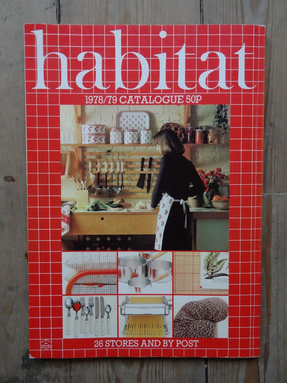
The Habitat Catalogue III: 1978/79

      Back to another occasional series - vintage Habitat catalogues.  This one from the end of the 1970s.
     The cover is meshed in 'Chic Graphique', and it marks a change in Habitat style.  The room set is altogether smoother and slicker than had been the case before.  There is still texture but it isn't quite so important. Glossier if you will.  I always think that Habitat was always slightly aloof from the slicker elements of Post War design. It did indeed take on board certain elements, such as the International Modern and Art Deco/Art Deco revival that could be described as 'slick', (as I said before Habitat was incredibly eclectic in its inspiration), but Habitat, for me, seemed to exist in that hinter land between the Arts & Crafts and that highly textured Modernism that came in with the Maison Jaoul (Le Corbusier, 1954-56).
     This cover image can be read as emblematic of a sea-change in general taste as interiors and objects have continued to grow (regrettably) sleeker, shinier and more generic still since then - and let's be honest duller and blander.  It's the difference, say, between Terence Conran's 'The House Book' of 1974 and 'The New House Book' of  1985.  This change can also be seen in an architectural work that was opened in the year of this catalogue, 1978, and has featured in this blog before, The Sainsbury's Centre for Visual Arts, at the University of East Anglia, Norwich.  There seems in general to have been a growing dislocation between the interior and its user; and the space, which is essentially private, has taken on some of the aspects of a public one.  There is a danger too, if it hasn't already happened, of the interior ceasing to be 'present' to its user.
     However some of the room sets in this catalogue still reflect that old and happier interest, such as the kitchen on the back cover.  I think colour and texture - pattern too - are due for a return.  I miss them.
     I love the graphic grid bedding - it's nice to see masculine bedding.  Reminds me of a tattershall check shirt. Oddly. Note also the splashy flowery design, the sort of thing that would become very popular, and that must owe something to Matisse.  What I haven't shown you is the Marimekko bedding on the next page which I hate.  Green with a thin white diagonal stripe. It has a harsh quality, that spawned far too many imitators.


It's still a small ambition to own a Chesterfield sofa.