Yesterday's serendipitous discovery: Macmillan's History Pictures. Designed for schools, I guess they must be post war. Various artists were used, some well known such as Rowland Hilder who painted 'The Departure of the Mayflower 1620'. Ahh, the 'right but repulsive' Puritans. I think the 'Gentleman and attendants hawking, time of James I' may be by Alan Sorrell. I bought seven - six for me and one for the bf - try to guess which one! Each one is A2 size.
Showing posts with label illustration. Show all posts
Thursday, 5 February 2015
Wednesday, 30 April 2014
'The Broken Road', Patrick Leigh Fermor
Last week I finished reading 'The Broken Road - from the Iron Gates to Mount Athos' by Patrick Leigh Fermor, or rather to be accurate, written by Patrick Leigh Fermor and assembled and edited by Artemis Cooper and Colin Thubron. It is the third and final book describing the journey the eighteen year old Leigh Fermor made on foot in the year 1933 from London to Constantinople - one imperial capital to another. The first two books - 'A Time for gifts' and 'Between the Woods and the Water' were published in 1977 and 1986 respectively.
This third instalment never appeared in Leigh Fermor's life time, finding it difficult and then - as age over took him - impossible to complete. I have to confess I read this sort of trilogy in a funny order starting with the second book (bought at the superb 'Byzantium' exhibition at the R.A.) before reading the first book - alas I have yet finish, losing him somewhere in Austria. Another reason for this post is to show you some work by John Craxton - the book covers for those first two books. I presume the two men must have known each other living in Greece, certainly they shared a love for the place.
The cover for 'The Broken Road' has been designed by Ed Kluz, who just so happens to be one of my favourite contemporary artists. The publishers, Murray, couldn't have chosen better.
The three books are a outstanding literary achievement, evoking a world that has almost vanished, a world destroyed by totalitarianism, war and Modernity. A sense of loss, a poignancy, unsurprisingly, pervades the books, and I detect the influence of Chateaubriand's 'Memoires d'outre-tombe'. That remarkable journey also marks a change in Leigh Fermor's life, from a directionless teenager, expelled from several schools, to living a life that we mere mortals can only dream of; an interesting War, and then a life living on the Greek isles writing travel books.
'The Broken Road' starts with Leigh Fermor crossing the Danube into Bulgaria and follows him as he explores the landscapes - he has a keen eye for the natural world - and culture. All three books, it has to be said, are full of the most fascinating details. He travels south into the valley of the Maritza before heading north back over the Danube to Bucharest - the cosmopolitan life there is much to his liking, so much so he would return there later to live for four years with Princess Balasha Cantacuzino, a member of an ancient Byzantine noble family who had one member ascend the Imperial throne.
The cover for 'The Broken Road' has been designed by Ed Kluz, who just so happens to be one of my favourite contemporary artists. The publishers, Murray, couldn't have chosen better.
The three books are a outstanding literary achievement, evoking a world that has almost vanished, a world destroyed by totalitarianism, war and Modernity. A sense of loss, a poignancy, unsurprisingly, pervades the books, and I detect the influence of Chateaubriand's 'Memoires d'outre-tombe'. That remarkable journey also marks a change in Leigh Fermor's life, from a directionless teenager, expelled from several schools, to living a life that we mere mortals can only dream of; an interesting War, and then a life living on the Greek isles writing travel books.
'The Broken Road' starts with Leigh Fermor crossing the Danube into Bulgaria and follows him as he explores the landscapes - he has a keen eye for the natural world - and culture. All three books, it has to be said, are full of the most fascinating details. He travels south into the valley of the Maritza before heading north back over the Danube to Bucharest - the cosmopolitan life there is much to his liking, so much so he would return there later to live for four years with Princess Balasha Cantacuzino, a member of an ancient Byzantine noble family who had one member ascend the Imperial throne.
However back to the narrative: with the onset of Autumn Leigh Fermor resumes his journey returning to Bulgaria and the Black Sea Coast. He visits Mesembria, and is nearly drown on his journey south from there. The continuous narrative finishes abruptly at Burgas.
As he travelled Leigh Fermor kept a notebook/diary and the editors have used that to complete the journey to the Imperial City. However, as the they themselves readily admit, the notes Leigh Fermor took of his time in the city are scanty; there is no record, for instance of the impressions made on him by the architecture. The narrative does not however end there. With a letter of admittance from the Ecumenical Patriarch Leigh Fermor travelled into northern Greece and the great monastic republic of Mount Athos, the Holy Mountain, one of the most important centres of Orthodox spirituality. I think it is telling that the most complete section of the diary covers the time he spent on the Holy Mountain. It is tempting to see his journey as one of faith, a sort of pilgrimage, perhaps one not conventionally religious (I'm not sure whether Leigh Fermor converted to Orthodoxy, but I would like to think he did) but a search for the Pre-Modern
Sunday, 23 February 2014
F L Griggs RA RE 1876 - 1938
I have been labouring on this post for months on and off, and finally it is here - phew!
A page from the Highways and Byways of Sussex, 1904, Steyning Church
It was looking at Gavin Stamp's proficient pen drawings back in November last year that turned my mind back to a favourite illustrator of mine, Frederick Landseer Maur Griggs. Quite a mouthful. The 'Maur' was added when he converted to Roman Catholicism.
There were many fine architectural artists and illustrators in late Victorian and Edwardian Britain - but then it was Golden Age for architecture and related arts - Pennell, Haig, Atkinson, Brangwyn, Walcot, but for me the finest was Griggs. All of them could work in pen and ink with amazing fluency, but Griggs's work has an intensity and lyrical poetry that at times is breath taking. He was draftsman of prodigious talent, and an etcher of sometimes visionary transcendence. And being a bit of armchair biker myself I've always warmed to the idea of him biking around England drawing old buildings. Seems an ideal way of spending your time.
I was introduced to his work by an article by the architectural historian and critic Alan Powers - not a bad draughtsman himself - in 'Country Life' magazine (April 17th 1986). A fitting place considering that it too was a product of that late flowering in British architecture.
F L Griggs was born and raised in Hitchin, Hertfordshire - a small market town on the northern edge of the Chiltern Hills. He studied at the Slade School of Fine Art, in London, and 1897 he moved to Bedford to train as an architect under the Arts and Crafts influenced C E Mallows, who himself was no bad draughtsman. Before then however Griggs had been introduced to the work of Samuel Palmer (1805 -1881). Palmer, one of a number of followers of William Blake known as the 'Ancients', was a mystical painter and etcher of extraordinary, haunting vision. He was also a convert from non-conformity to High Anglicanism. Palmer's powerful influence, which was as much intellectual and spiritual as it was artistic, was to remain with Griggs for the rest of his life; and it is by the assimilation of both Palmer's life and work to his own, and later in life the direct and indirect influence he had on Graham Sutherland, Robin Tanner and Paul Drury, that Griggs became a link in a Romantic, if not mystical, chain that is a persistent, if sometime underground, element in English art.
Griggs soon earned a reputation as an excellent draftsman and made perspectives for other architects such as the Arts and Crafts practitioners Charles Ashbee and Guy Dawber. In 1902 he commenced work the 'Highways and Byways' volume on Hertfordshire. He had in effect become a full-time illustrator, and henceforth it seems practiced architecture rarely - I have only found a few examples of his work, and two of those were domestic work, (a renovation and a 'new build'), for himself. The 'Highways and Byways' work would, unintentionally, occupy the rest of his life, illustrating a further 12 volumes right up until the time of his death.
Another page from the 'Highways and Byways of Sussex', 1904, showing the Market Cross and Cathedral Spire, Chichester.
Yet another page from the Highways and Byways of Sussex, 1904, Old Shoreham Church
For me the Arts and Crafts movement is pervaded by a sense of deep loss, and it is that sense of things being under threat from industrialisation and progress that can be sensed, I think, in Griggs's illustrations. It can be argued that for all of Morris's revolutionary socialism the Arts and Crafts movement was essentially conservative - I'm tempted to label it 'High Tory'. It was just as concerned with the preservation of the past as it was with creating new work. It's been commented that Griggs's illustrations concentrate on the old to the exclusion of later things; certainly his laborious technique responds most warmly to old buildings - buildings that is with texture and patina. The magic is just a bit lacking in his drawing of the Pantiles in Royal Tunbridge Wells. There is however more than that; due to the intellectual influence of Pugin and Ruskin Arts and Crafts practitioners privileged the Middle Ages and had a suspicion of Classicism, which in some ways seen as destructive an influence as industrialisation on native traditions, and I believe that influence is observable in Griggs's illustrations with their careful editing out of the modern world. I think this can be summed up in his own words. In 1937 he undertook his last 'Highways and Byways' - Essex, and wrote of the experience, which he undertook to support his family, in these terms: "Towards the end I began to get very sick of it, and remembered [Samuel] Palmer's 'The Past for Poets, the Present for Pigs' and was mightily glad to be back among my books again." F L Griggs died the next year, the final volume incomplete.*
There is something more with Griggs that sets him apart from the rest of the Arts and Crafts movement: for Morris socialism and art took the place of religion - 'spilt religion', according to T E Hulme. In 'News from Nowhere' Morris envisaged the post-revolutionary society to be a kind of 'cleansed' Middle Ages - cleansed of religion as well as Capitalism. A godless society. An anarchistic one too. Griggs however followed Pugin: in 1912 he converted to Roman Catholicism. His utopia had to be western catholic if it was ever it to be like the Middle Ages. There is a logic to that. However, as Pugin himself realised, Roman Catholicism had changed post the Reformation crisis, and itself had to be restored. And so with Griggs, as with Pugin, there came a spiritual as well as a material nostalgia. This reflected clearly in a great series of visionary etchings he undertook after 1912 until his death, the year (I believe) he established 'The Dover's House Press' to publish his own work. Influenced by the etching's of Palmer they evoke not the High Church vision of a pastoral Eden, but the Catholic High Middle Ages, and also the melancholy post Reformation decay of the fabric of Catholic England. And as with his other work the etchings are suffused with light - his love of East Anglia surely? Noticeable is general absence of people. Noticeable too the metamorphosis - England is transformed, and her architecture has become elemental, sublime as though grown out of the earth itself and not the work of man.
I think it was during my teens, or perhaps during my twenties I saw a documentary on Robin Tanner, the etcher and illustrator; he related how he had been asked that considering his 'radical' politics why his art hadn't taken on a more political or radical aesthetic. His reply was that by showing the world as it once was, or could yet be, his work was his protest.
* It was finished by Stanley Badmin
Monday, 7 October 2013
Alan Sorrell Part III 'Saxon England'
I had made plans to write this post a few weeks ago, but my attention was diverted by clearing out my late Aunt's flat - an deeply emotional experience that is still sending out it's little ripples of sadness.
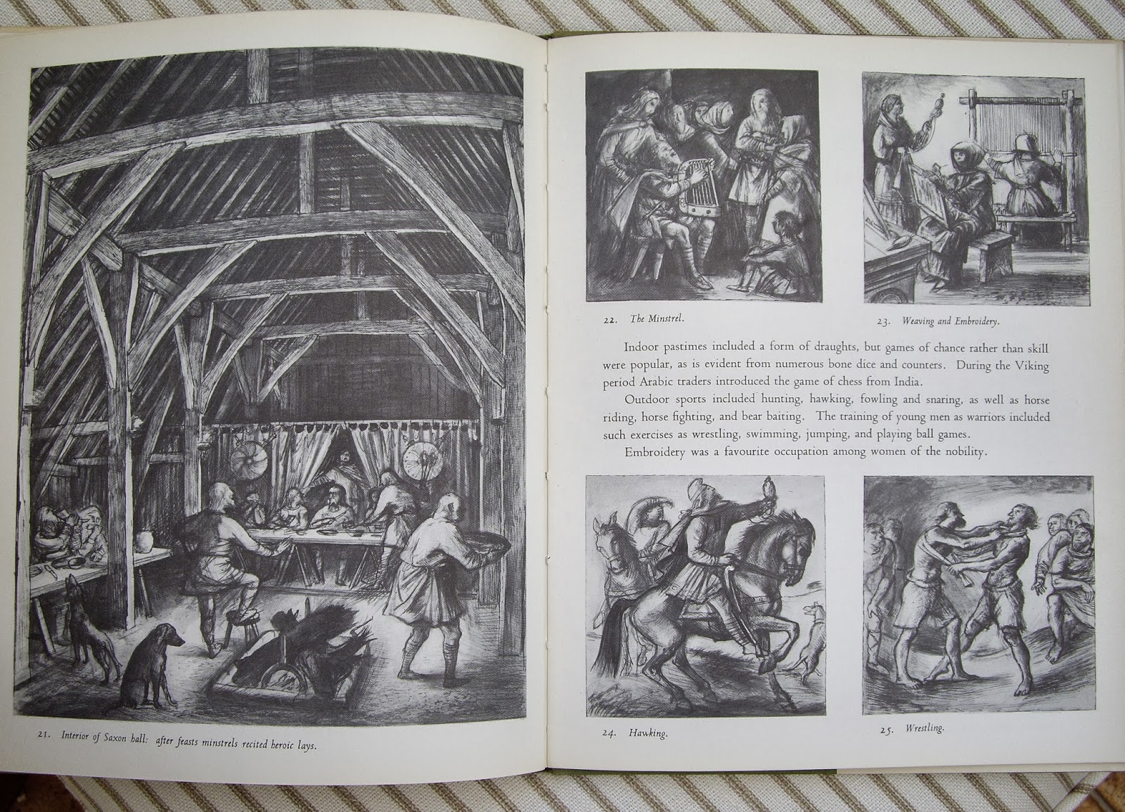
So here, somewhat delayed, is the third in my occasional series on the work of the artist and illustrator Alan Sorrell. This is an book in the series he illustrated for the Lutterworth Press. His collaborator this time was the archaeologist John Hamilton. The cover is certainly brighter than the one he drew for 'Roman Britain'. There is something in the quality of both colour and drawing that reminds me of the work of Pauline Baynes (1922-2008) - the illustrator of, amongst other things, 'The Chronicles of Narnia' published by Geoffrey Bles.) The most Neo-Romantic illustration is that of a Celtic monastery, a composition that seems to echo a lithograph by John Piper. That brings me briefly on to the slightly unsuitable title, perhaps 'Dark Age Britain' would have been more appropriate for a book that covers all of these isles.
Wednesday, 10 July 2013
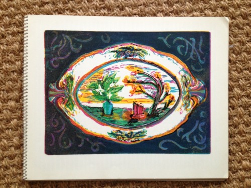
'Ceramics: A Book of Colour Prints'
I've just seen this on the blog 'Flotsam and Jetsam'. Looks great.
I hurriedly wrote this post on Wednesday, such was my enthusiasm for this slight (?) tome. I did, however, also e-mail the author of 'Flotsam and Jetsam' Simon Martin asking permission to upload on to this blog one of his photographs. He kindly consented to this.
It's delightful, and I hope it's whetted your appetite. To find out more just click on link above.
Thank you again Simon. It's greatly appreciated
I hurriedly wrote this post on Wednesday, such was my enthusiasm for this slight (?) tome. I did, however, also e-mail the author of 'Flotsam and Jetsam' Simon Martin asking permission to upload on to this blog one of his photographs. He kindly consented to this.
| Photograph courtesy of Simon Martin |
It's delightful, and I hope it's whetted your appetite. To find out more just click on link above.
Thank you again Simon. It's greatly appreciated
Monday, 25 March 2013
Alan Sorrell Part II 'Roman Britain'
This was one of the books illustrated by Alan Sorrell that I came across in our local library as a child.
Wednesday, 13 March 2013
Alan Sorrell Part I
A month ago (can it really be as long as that?) Ben Pentreath on his blog 'Inspirations' shared his discovery of the work of illustrator and author Rena Gardiner. Reading about Rena's work my mind turned to one of my favourite illustrators: Alan Sorrell. I first discovered his work as a child, firstly I suppose in our local library, and then on our annual holiday in Scotland where I found his work on postcards and in the guides available at Ancient Monuments: St Andrews Cathedral and Priory; Dryburgh, Melrose and Jedburgh Abbeys. A subsequent holiday in Wales brought further examples of his work.
Alan Sorrell (1904 - 1974) trained firstly at Southend School of Art and then, after two years as a commercial artist, at the Royal College of Art. His contemporaries there included Bawden. During WWII he served as an Official War Artist with the RAF. His is mainly remembered today for the beautiful drawings he produced re-constructing ancient sites - this side of his work was the result of a chance meeting with Kathleen Kenyon, 'the most influential female archaeologist of the 20th century', in 1938. Some of these were produced for the Ministry of Works, others as book illustrations, such as the series produced for The Lutterworth Press in the early 1960s - 'Prehistoric Britain', 'Roman Britain', 'Saxon England', 'Norman Britain' and 'Medieval Britain'. Although Alan Sorrell illustrated every one in the series, each book had a different author. In 'Roman Towns in Britain' he wrote the text as well as drew the illustrations (published posthumously by Batsford 1976). He also produced a number of murals, including one for the Festival of Britain.
Alan Sorrell's work is deeply atmospheric, evocative. Neo-romantic. The skies scowl with rain clouds. Wind whips the smoke. People gather in groups; they hurry to a race track in Roman Wroxeter; they flee a smoking Roman villa that is being sacked by Saxon raiders. People shop, they listen to speeches and watch jugglers. His pictures are more than mere re-constructions - they live.
There will be an exhibition of Alan Sorrell's work later this year at the Sir John Soane's Museum (October 25th 2013 - January 45th 2014)
Alan Sorrell (1904 - 1974) trained firstly at Southend School of Art and then, after two years as a commercial artist, at the Royal College of Art. His contemporaries there included Bawden. During WWII he served as an Official War Artist with the RAF. His is mainly remembered today for the beautiful drawings he produced re-constructing ancient sites - this side of his work was the result of a chance meeting with Kathleen Kenyon, 'the most influential female archaeologist of the 20th century', in 1938. Some of these were produced for the Ministry of Works, others as book illustrations, such as the series produced for The Lutterworth Press in the early 1960s - 'Prehistoric Britain', 'Roman Britain', 'Saxon England', 'Norman Britain' and 'Medieval Britain'. Although Alan Sorrell illustrated every one in the series, each book had a different author. In 'Roman Towns in Britain' he wrote the text as well as drew the illustrations (published posthumously by Batsford 1976). He also produced a number of murals, including one for the Festival of Britain.
Alan Sorrell's work is deeply atmospheric, evocative. Neo-romantic. The skies scowl with rain clouds. Wind whips the smoke. People gather in groups; they hurry to a race track in Roman Wroxeter; they flee a smoking Roman villa that is being sacked by Saxon raiders. People shop, they listen to speeches and watch jugglers. His pictures are more than mere re-constructions - they live.
There will be an exhibition of Alan Sorrell's work later this year at the Sir John Soane's Museum (October 25th 2013 - January 45th 2014)
Roman Towns in Britain
Looking somewhat tatty. As a child I bought, or was bought, this book in 'Bertram A Watts' - the bookshop in Sherringham, north Norfolk. A visit to family in Norfolk would invariably conclude in Sherringham with a walk along the 'prom' and a visit to the bookshop. The quayside, London. The stream to the left is the Walbrook
Venta Icenorum, from the air
The Balkerne Gate, Colchester
The Forum, St Albans
The Baths, Wroxeter
Monday, 11 February 2013
'Follies'
The illustrations alternate between line and colour. I think the latter are more successful. As you can see they have a lithographic quality that is rather attractive. I particularily like the narrow colour palette. They also show the influence of John Piper, which for me is seldom a bad thing. (In a the notes at the end of the book - first mention of the artist at all, poor chap - it states that 'the colour drawings were worked out as auto-lithographs.')
As I type this post I am listening to 'The Late Paul Barnes Show', broadcast originally late Saturday night/early Sunday morning. (Good old i-player) It's one of the best, if somewhat eccentric, jazz programmes on British radio, and local radio too. I recommended it.
Labels:
books,
Follies,
Hugh Casson,
illustration,
Paul Sharp,
The Late Paul Barnes
Subscribe to:
Posts (Atom)