Monday, 28 April 2014

The Rampant Lions Press at the Fitzwilliam


   The Craxton exhibition was not alone.  By chance the bf and I discovered in the museum shop that there was a retrospective on the work of The Rampant Lion Press.  I suspect that this was more to the bf's liking.  And because I came to it fresh, rather than freighted with preconceptions and the like, it was a serendipitous delight. In a quiet self-effacing, English, sort of way. The gallery itself is a small octagon linking two larger spaces.  There were six glass cases around the room and in the centre a case containing the Kelmscott Press 'Earthly Paradise' and the Clover Hill Editions 'The Story of Cupid and Psyche' (1974).  There had been a previous exhibition of the work of The Rampant Lions Press in 1982 and this current exhibition was a brief survey of the work of the press had undertaken since then.


   The Rampant Lions Press was established between the wars by Will Carter, (1912-2001), a cousin of the designer and illustrator Reynolds Stone.  The press continued until 2008, under Will's son Sebastian who had joined his father in the 1960s.  They produced a series of beautiful books, sometimes experimental, collaborating with a number of writers and illustrated by the likes of John Piper and Michael Ayrton.  I particularly like the use of coloured papers, as above.  The Dante font illustrated below, I find, is singularly beautiful. In addition Will Carter worked with the Cambridge University Press. The exhibition also reminds us that Cambridge has and continues to be an important centre for craft and art production in Britain.

   There are a number of editions still available to buy: www.rampantlionspress.com where you can also read a much fuller history of the press.


   The exhibition continues until May 18th.

Friday, 18 April 2014

John Craxton at the Fitzwilliam


   On Sunday, with the bf, I went to the Craxton exhibition at the Fitzwilliam Museum in Cambridge. It was a relatively small affair, and only touched upon his graphic work, which I particularly like. More of that in a future post. Outside the gallery in the lobby space was a video playing of Sir David Attenborough (just him?) talking about the artist. The space was small, crowded at times and too loud. We didn't stay to find out if anybody else appeared.
   Craxton, like many of his contemporaries, such as John Piper or Osbert Lancaster, worked in a number of disciplines – illustration, ‘fine art’, theatre design. In fact compared to a polymath such as Piper, or say Robert Harling, Craxton’s reach seems rather narrow – but that’s only relative. Luckily for them there was less specialization than there is now and I suspect that the width and indeed depth of their knowledge was greater than today too.
   Craxton was born in 1922 into a middle class family. His entry into the art world seems to have been quite precocious but due to circumstances Craxton’s formal art education, at least at a tertiary level, was quite limited. Unfit for active service he spent the War in London sharing a studio with Lucian Freud. The two men spent the time honing their drawing skills. They were also courted by luminaries of the London art scene. They were funded by Peter Watson and went drawing in Pembrokeshire with Graham Sutherland. The first work on display dates from this period. It is deeply Neo-Romantic, dark and brooding, and some of it surprisingly monumental, but essentially graphic work in ink and none the worse for that. (If the selection made for this exhibition is anything to go by the oils of that period tend to be small.) Nature is transformed into something writhing and menacing; trees, for instance, mutated into something massive and fleshy like tentacles; figures are submerged in the foliage or hide in the trunks of ancient oaks. There is his famous study of a dead hare, (Craxton and Freud drew a lot of dead animals), revealing incidentally a love for use of coloured paper – usually a mid-tone that enabled him to use both black and white media to build up volume and texture. These are my favourite works in the exhibition, although a couple of portraits done later in Greece were a revelation: small and intense, they could have been the work of a Northern Renaissance master. I suspect that like John Minton, Craxton was really a graphic artist, and that it was only through dint of hard work that he managed to ‘think big’. The ‘Pastoral for PW’, 1948, (80” x 103”), shows him struggling with scale.
   By then Craxton had visited Greece and had fallen in love with both people and landscape. He eventually settled there, semi permanently, until his death in 2009. It was to have a profound effect on his art. Not only does the work become brighter and more colourful, but his discovery of the mosaics of the Easter Roman Empire and early medieval Italy (by their nature monumental), finally gave him the language, the ability, to work on a larger, monumental, scale. I suspect the increasing use of a thick line of paint (the width of a tessera?) around each separate object or volume is a direct influence.
I wonder, in retrospect, whether Craxton had, at any one time, two vocabularies: one was employed when he was drawing from life, and I think was pretty constant and was honed in those years working with Freud – what one might consider empirical; and the other a more stylised, perhaps even self-conscious, manner of the public art in which the imagination and the intellect come into play. Sometimes that come close to each other, other times there is more distance.
   In preparing this post I’ve re-read the chapter on Craxton in Malcom Yorke’s ‘The Spirit of Place: Nine Neo-Romantic Artists and their times’ (Constable, London, 1988), and found myself in sympathy with the opinions of some of the critics. There is just something missing, particularly in the later work with their acid colours and frankly decorative quality – ‘a bit GayTimes’ commented the bf about a group of their sailors eating and drinking about a taverna table. It was hard to disagree.

Thursday, 17 April 2014

Work in progress....

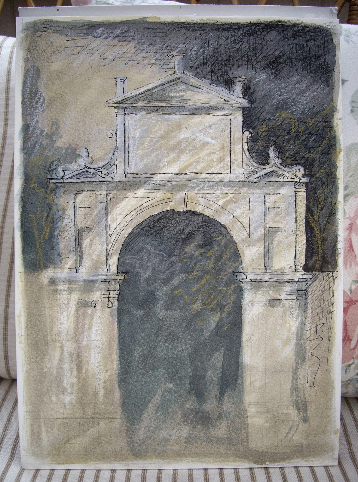
   Here's an update on the watercolour drawing I posted yesterday plus another arch from the 'Extraordinario Libro' by Serlio.


Tuesday, 15 April 2014

Work in Progress

    Thanks to Vaughan Hart's book on Nicholas Hawksmoor, I've become interested in the work of Sebastiano Serlio (1475 - 1554), particularly the 'Extraordinario Libro di Architettura' (Hart refers to it as the 'Libro Extraordinario').  Several of the plates (showing gates) in the 'Extraordinario' are used in Hart's book to illustrate the influence of Serlio on Hawksmoor.  Inspired myself by the designs I have begun a series of watercolour/mixed media drawings based on the designs.  This one is the first one I feel any confidence about.


Monday, 31 March 2014

Laura Ashley

The regular reader will know that I have a deep admiration for some of the fabrics and wallpaper created by Laura Ashley in the 1970s and early 1980s.  Looking at early editions of the World of Interiors in my collection (alas an incomplete one) Laura Ashley is ubiquitous, to be found in all sorts of places, from the Country house downwards; and there is a sort democracy to that I find pleasing and that harks back to Arts and Crafts theory.  There was also a sort of high seriousness, an earnestness, about those early designs; more than a hint of the Gothic Revival with their heraldic beasts. Colours, fittingly, could be incredibly bold and striking - rich and dark in a way unimaginable today.  At least on the High St.  Looking around Pinterest I found these designs to illustrate.  Apologies if you find an image of yours in this selection.  I hope you don't mind.


As an addendum I'd like to add these images of Laura Ashley designs in my own collection(!)  The first is a piece of wallpaper from a roll I bought sometime in the late 1980s and was never used except to line drawers and shelves.  I rescued this piece, and three others, from some bedroom furniture that had been my parents and I was about to throw out.  The other two, the dark, dark blue 'Lady Fern' and 'Elizabethan Trellis' I bought recently on ebay. 


Tuesday, 4 March 2014

St John The Baptist, Morton

   St John the Baptist, Morton, stands at the end of the long and wide village street that leads from the 'high' land to the west, east into the fens. Morton has this long, linear pattern in common with the other three fen edge villages that have already appeared in this blog: Thurlby, Baston & Langtoft.  Like the latter two it has no village green as such (Thurlby had a village green but, in what can be only described as an act of vandalism, that was built over in the sixties and seventies).
   Morton is a grand, rather imposing church, being cruciform (almost), with a tall central tower, and built upon a mound.  Most of what you can see from the outside is Perpendicular.  There are north and south doors to the nave, but the main entrance is from the west.  The west door is protected by a porch - quite a rare thing. The top of the  tower is very close in design to the one at Bourne Abbey Church.  The interior is spacious, but, alas, there are no fittings of note.  The best thing is the space under the tower, which has a tierceron vault decorated with cusping and a circular bell-hole. I think that in Pevsner it is described (wrongly) as a fan vault. There are also a number of bold foliage capitals, the carving like that Langtoft (see previous post).