Tuesday, 11 March 2014
Tuesday, 4 March 2014
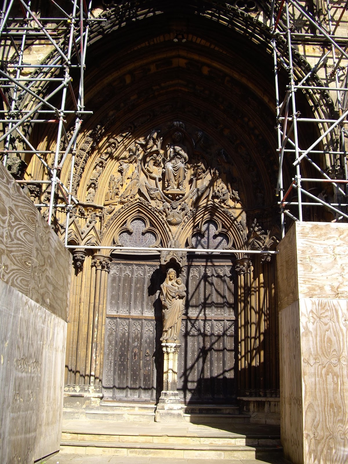
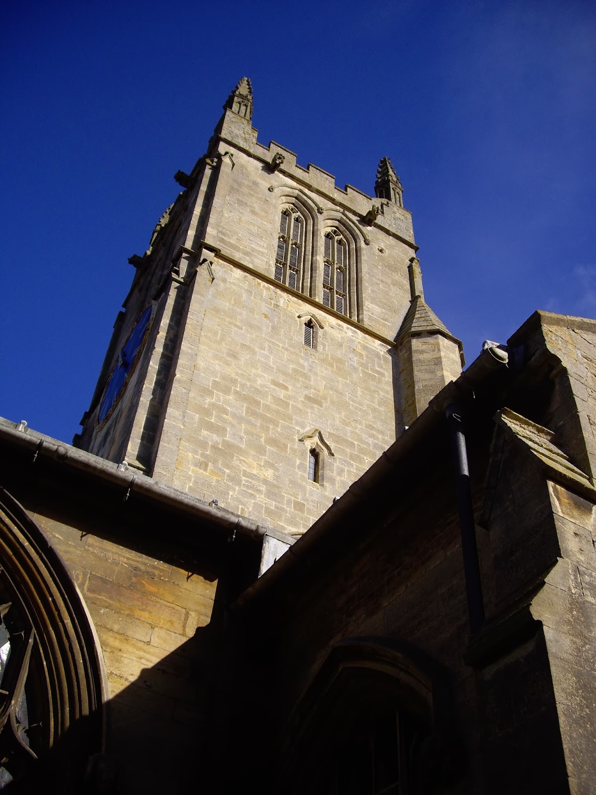
St John The Baptist, Morton
St John the Baptist, Morton, stands at the end of the long and wide village street that leads from the 'high' land to the west, east into the fens. Morton has this long, linear pattern in common with the other three fen edge villages that have already appeared in this blog: Thurlby, Baston & Langtoft. Like the latter two it has no village green as such (Thurlby had a village green but, in what can be only described as an act of vandalism, that was built over in the sixties and seventies).
Morton is a grand, rather imposing church, being cruciform (almost), with a tall central tower, and built upon a mound. Most of what you can see from the outside is Perpendicular. There are north and south doors to the nave, but the main entrance is from the west. The west door is protected by a porch - quite a rare thing. The top of the tower is very close in design to the one at Bourne Abbey Church. The interior is spacious, but, alas, there are no fittings of note. The best thing is the space under the tower, which has a tierceron vault decorated with cusping and a circular bell-hole. I think that in Pevsner it is described (wrongly) as a fan vault. There are also a number of bold foliage capitals, the carving like that Langtoft (see previous post).
Sunday, 23 February 2014
F L Griggs RA RE 1876 - 1938
I have been labouring on this post for months on and off, and finally it is here - phew!
A page from the Highways and Byways of Sussex, 1904, Steyning Church
It was looking at Gavin Stamp's proficient pen drawings back in November last year that turned my mind back to a favourite illustrator of mine, Frederick Landseer Maur Griggs. Quite a mouthful. The 'Maur' was added when he converted to Roman Catholicism.
There were many fine architectural artists and illustrators in late Victorian and Edwardian Britain - but then it was Golden Age for architecture and related arts - Pennell, Haig, Atkinson, Brangwyn, Walcot, but for me the finest was Griggs. All of them could work in pen and ink with amazing fluency, but Griggs's work has an intensity and lyrical poetry that at times is breath taking. He was draftsman of prodigious talent, and an etcher of sometimes visionary transcendence. And being a bit of armchair biker myself I've always warmed to the idea of him biking around England drawing old buildings. Seems an ideal way of spending your time.
I was introduced to his work by an article by the architectural historian and critic Alan Powers - not a bad draughtsman himself - in 'Country Life' magazine (April 17th 1986). A fitting place considering that it too was a product of that late flowering in British architecture.
F L Griggs was born and raised in Hitchin, Hertfordshire - a small market town on the northern edge of the Chiltern Hills. He studied at the Slade School of Fine Art, in London, and 1897 he moved to Bedford to train as an architect under the Arts and Crafts influenced C E Mallows, who himself was no bad draughtsman. Before then however Griggs had been introduced to the work of Samuel Palmer (1805 -1881). Palmer, one of a number of followers of William Blake known as the 'Ancients', was a mystical painter and etcher of extraordinary, haunting vision. He was also a convert from non-conformity to High Anglicanism. Palmer's powerful influence, which was as much intellectual and spiritual as it was artistic, was to remain with Griggs for the rest of his life; and it is by the assimilation of both Palmer's life and work to his own, and later in life the direct and indirect influence he had on Graham Sutherland, Robin Tanner and Paul Drury, that Griggs became a link in a Romantic, if not mystical, chain that is a persistent, if sometime underground, element in English art.
Griggs soon earned a reputation as an excellent draftsman and made perspectives for other architects such as the Arts and Crafts practitioners Charles Ashbee and Guy Dawber. In 1902 he commenced work the 'Highways and Byways' volume on Hertfordshire. He had in effect become a full-time illustrator, and henceforth it seems practiced architecture rarely - I have only found a few examples of his work, and two of those were domestic work, (a renovation and a 'new build'), for himself. The 'Highways and Byways' work would, unintentionally, occupy the rest of his life, illustrating a further 12 volumes right up until the time of his death.
Another page from the 'Highways and Byways of Sussex', 1904, showing the Market Cross and Cathedral Spire, Chichester.
Yet another page from the Highways and Byways of Sussex, 1904, Old Shoreham Church
For me the Arts and Crafts movement is pervaded by a sense of deep loss, and it is that sense of things being under threat from industrialisation and progress that can be sensed, I think, in Griggs's illustrations. It can be argued that for all of Morris's revolutionary socialism the Arts and Crafts movement was essentially conservative - I'm tempted to label it 'High Tory'. It was just as concerned with the preservation of the past as it was with creating new work. It's been commented that Griggs's illustrations concentrate on the old to the exclusion of later things; certainly his laborious technique responds most warmly to old buildings - buildings that is with texture and patina. The magic is just a bit lacking in his drawing of the Pantiles in Royal Tunbridge Wells. There is however more than that; due to the intellectual influence of Pugin and Ruskin Arts and Crafts practitioners privileged the Middle Ages and had a suspicion of Classicism, which in some ways seen as destructive an influence as industrialisation on native traditions, and I believe that influence is observable in Griggs's illustrations with their careful editing out of the modern world. I think this can be summed up in his own words. In 1937 he undertook his last 'Highways and Byways' - Essex, and wrote of the experience, which he undertook to support his family, in these terms: "Towards the end I began to get very sick of it, and remembered [Samuel] Palmer's 'The Past for Poets, the Present for Pigs' and was mightily glad to be back among my books again." F L Griggs died the next year, the final volume incomplete.*
There is something more with Griggs that sets him apart from the rest of the Arts and Crafts movement: for Morris socialism and art took the place of religion - 'spilt religion', according to T E Hulme. In 'News from Nowhere' Morris envisaged the post-revolutionary society to be a kind of 'cleansed' Middle Ages - cleansed of religion as well as Capitalism. A godless society. An anarchistic one too. Griggs however followed Pugin: in 1912 he converted to Roman Catholicism. His utopia had to be western catholic if it was ever it to be like the Middle Ages. There is a logic to that. However, as Pugin himself realised, Roman Catholicism had changed post the Reformation crisis, and itself had to be restored. And so with Griggs, as with Pugin, there came a spiritual as well as a material nostalgia. This reflected clearly in a great series of visionary etchings he undertook after 1912 until his death, the year (I believe) he established 'The Dover's House Press' to publish his own work. Influenced by the etching's of Palmer they evoke not the High Church vision of a pastoral Eden, but the Catholic High Middle Ages, and also the melancholy post Reformation decay of the fabric of Catholic England. And as with his other work the etchings are suffused with light - his love of East Anglia surely? Noticeable is general absence of people. Noticeable too the metamorphosis - England is transformed, and her architecture has become elemental, sublime as though grown out of the earth itself and not the work of man.
I think it was during my teens, or perhaps during my twenties I saw a documentary on Robin Tanner, the etcher and illustrator; he related how he had been asked that considering his 'radical' politics why his art hadn't taken on a more political or radical aesthetic. His reply was that by showing the world as it once was, or could yet be, his work was his protest.
* It was finished by Stanley Badmin
Saturday, 22 February 2014
'Andrei Rublev' & 'The Colour of Pomegranates'
A couple of days with the bf this week.
Andrei Rublev
Wednesday afternoon we sat down and watched 'Andrei Rublev' by Tarkovsky. It seemed to be the moment to embrace the inevitable and watch one. The bf is a great Tarkovsky fan, but I had always quailed at the thought of having to watch one - immensely long, difficult, surrounded by a fog of film-studies speak. I had already attempted to come to grips, if that is at all possible, with 'Last Year in Marienbad' (Alain Resnais). I gave up. As regular readers of this blog (are there any?) will have read before I have watched 'La Notte' (Michelangelo Antonioni) but bailed out of 'Il Deserto Rosso' after half an hour. What we call the 'Half-hour Rule'. Subsequently I found 'Blow-up' and love it. It's partly that Sixties thing.
(That was a particularly heavy weekend - the one we watched 'La Notte' and 'Il Deserto Rosso' because we also watched 'Il Gattopardo' and 'Roma'. And other things, too.)
I was expecting something of 'Marienbad' with 'Andrei Rublev', but was instead bowled over by the experience. It was one of the most moving, spiritual cinematic experiences I have yet had. I couldn't speak at the end (for fear of crying). At times haunting, moving, shocking, visceral. I was particularly struck, forgive the pun, by the acts of violence, which seemed the more shocking by often being unheralded. I was greatly moved by the sack of Vladimir - by the crowds praying inside the Cathedral, putting me in mind of the two great sacks of Constantinople (1204 and 1453) - those two great sins - when crowds filled Hagia Sophia as the barbarians flooded the city. There was also the scene when the mould for the bell was fired, and when later it was first rung.
'Andrei Rublev' is a fictionalized account of the Late Medieval Russian Icon painter of the same name. It has no concern with is early life; its concern is solely his life as an artist in the context of his spiritual life. The film is constructed of sequential seven chapters, with shorter prologue and epilogue. We see no painting taking place, but instead each scene portrays an event with profound spiritual consequences for Rublev. Writing this I am inclined to see a influence of Dostoevsky in this structure and use of symbolism in the film.
The influence of Antonioni is also there - there from the start in a certain disembodied feel. A distance. And yes, it is hard work, but the rewards are enormous. I was put in mind of Sergei Parajanov's film 'The Colour of Pomegranates' - another film that was a bf introduction, and now a favourite of mine. A bio-pic of an artist - an emblematic artist in a particular culture, Parajanov's film follows 'Andrei Rublev' by being also structured into a series of events, or chapters. The scenes build on Tarkovsky by being much more staged - a series of tableaux vivant that recall Armenian and Byzantine illuminated manuscripts. That 'staged' quality is latent in Tarkovsky, it is certainly never explicit. Dramatic tension in both films is held in check. Tarkovsky in fact builds tension in a very skilled manner, necessary given the length of the film. I'm inclined to speculate that both films have a liturgical quality that comes from a liturgical culture that is still (thankfully) hieractic and static, indeed both films are curiously at odds with the then prevailing authorities of the Soviet Union.
See both films - your efforts will be amply rewarded!
(That was a particularly heavy weekend - the one we watched 'La Notte' and 'Il Deserto Rosso' because we also watched 'Il Gattopardo' and 'Roma'. And other things, too.)
I was expecting something of 'Marienbad' with 'Andrei Rublev', but was instead bowled over by the experience. It was one of the most moving, spiritual cinematic experiences I have yet had. I couldn't speak at the end (for fear of crying). At times haunting, moving, shocking, visceral. I was particularly struck, forgive the pun, by the acts of violence, which seemed the more shocking by often being unheralded. I was greatly moved by the sack of Vladimir - by the crowds praying inside the Cathedral, putting me in mind of the two great sacks of Constantinople (1204 and 1453) - those two great sins - when crowds filled Hagia Sophia as the barbarians flooded the city. There was also the scene when the mould for the bell was fired, and when later it was first rung.
'Andrei Rublev' is a fictionalized account of the Late Medieval Russian Icon painter of the same name. It has no concern with is early life; its concern is solely his life as an artist in the context of his spiritual life. The film is constructed of sequential seven chapters, with shorter prologue and epilogue. We see no painting taking place, but instead each scene portrays an event with profound spiritual consequences for Rublev. Writing this I am inclined to see a influence of Dostoevsky in this structure and use of symbolism in the film.
The influence of Antonioni is also there - there from the start in a certain disembodied feel. A distance. And yes, it is hard work, but the rewards are enormous. I was put in mind of Sergei Parajanov's film 'The Colour of Pomegranates' - another film that was a bf introduction, and now a favourite of mine. A bio-pic of an artist - an emblematic artist in a particular culture, Parajanov's film follows 'Andrei Rublev' by being also structured into a series of events, or chapters. The scenes build on Tarkovsky by being much more staged - a series of tableaux vivant that recall Armenian and Byzantine illuminated manuscripts. That 'staged' quality is latent in Tarkovsky, it is certainly never explicit. Dramatic tension in both films is held in check. Tarkovsky in fact builds tension in a very skilled manner, necessary given the length of the film. I'm inclined to speculate that both films have a liturgical quality that comes from a liturgical culture that is still (thankfully) hieractic and static, indeed both films are curiously at odds with the then prevailing authorities of the Soviet Union.
See both films - your efforts will be amply rewarded!
Andrei Rublev
1966
Producer: Tamara Ogorodnikova
Director: Andrei Tarkovsky
Cinematographer: Vadim Yusov
The Colour of Pomegranates
Producer: Tamara Ogorodnikova
Director: Andrei Tarkovsky
Cinematographer: Vadim Yusov
The Colour of Pomegranates
1968
Producer: -
Director: Sergei Parajanov
Cinematographer: Suren Shakhbazyan
Producer: -
Director: Sergei Parajanov
Cinematographer: Suren Shakhbazyan
Monday, 17 February 2014
Valentine's Day Card 2014
The year's card has taken the form of a book. Each 'page' measures 4 x 5cms and consists of one hand-drawn letter 'imposed' on a landscape background. The letters were drawn out, and the landscape sketched in, in pencil before being worked up in biro, coloured pencil and watercolour. Mulling over the concept I looked at 16th &17th century Emblem Books and the illustrations in the 'Hypnerotomachia Poliphilii'.
The backgrounds show an Italianate landscape giving way through an arch into a enclosed garden where it is spring. The enclosed garden seems a recurring theme in my work.
The 'book' in production
The two sections glued together and folded.
A close up
The cover
Cover attached
Another close up
The book wrapped up and ready for the envelope.
The 'book' in production
The two sections glued together and folded.
A close up
The cover
Cover attached
Another close up
The book wrapped up and ready for the envelope.
Friday, 17 January 2014
Alan Sorrell at Sir John Soane's Museum
Yesterday I went down to London to visit the exhibition of the work of Alan Sorrell currently on at Sir John Soane's Museum. As regular readers of this blog will know I have written several posts on his work. It is a particular favourite of mine.
Perhaps it was the amount of scaffolding in the courtyard, but walking through Soane's house, (an experience I hadn't repeated since the 1980s), I was struck firstly by the progression from dark to light that the house possesses, from the sombre ground floor to the yellow drawing room on the first floor. I was also struck with the amount of allusion and suggestion that the house evokes, for all the classicism the house is a monument to Romanticism. It is a short step, perhaps, from the evocation of a religious sensibility in light and space in Soane's house to Pugin and the Oxford Movement. From associative values to the real thing. Thirdly the penumbra, the accretion of objects, seemed to presage so much of High Victorian aesthetic values.
The exhibition space, located in the house next door, is a relatively new addition to the museum. I believe it was this house - itself a work of Soane - that was lived in by the director of the museum. I could be wrong. The exhibition itself is small, though I was far from disappointed - occupying two rooms. It is complimented by an excellent book. The exhibits are particularly well chosen to illustrate the facets of Sorrell's work, both private as well as the public. I responded in particular to his technique - often the paper surface, worked with paint, ink, pencil, gouache, wax resist, charcoal, has a wonderful tactile quality. At one time, I guess, this technique would be considered impure. But it suits me fine. It must partly through these techniques as well as the heightened atmosphere of much of his work that links Sorrell to the Neo-Romantics; certainly there is desire in his work to evoke a sense of place and 'atmosphere'. However I don't feel that abiding sense of unease in Sorrell's work that is often found in many Neo-Romantic artists. In fact there is much that is cheerful, if not playful in his work. Indeed sometimes there is an element of caricature about it. In the mural, 'Working boats from around the British Coast' - a five panelled work in oil from the 'Nelson Bar' of HMS Campania, two panels of which are on display at the exhibition - this is particularly so. It's a light, happy piece. Stylistically different too for being solely in one medium - oil. I can't imagine many other Neo-Romantics being able to pitch their work so. The murals were indeed a revelation. Two stand out: 'The Seasons' at Myton (formerly Oken) School, Warwick, and the work he undertook at the Old Bexhill parish church. If anything lets them down is that sense of the grotesque, of the caricature that creeps in. Thankfully it is kept mostly in check. It is however a minor quibble and would that he had done more work of this type. This light heartedness - dare I say charm? - stands in contrast to the serious, intense self-portrait he made in Nov 1928, as a Rome Scholar - does it reflect the influence of contemporary Italian artists? I'm not sure. It displays a crisp, angular analytical style - the influence also of Wyndham Lewis? - that soon gave way to his mature style.
Rather like the work of the architect Stephen Dykes Bower, Sorrell's work is both, paradoxically, known and unknown, in that the work of both men are woven into the fabric of so many lives in Post-War Britain and yet go uncredited. Who hasn't seen the work of Dykes Bower at Royal and National services at both Westminster Abbey and St Paul's Cathedral? Who, growing up in Post War Britain hasn't seen Sorrell's illustrations in a library book or on a visit to a ruined castle or abbey? That was certainly my experience and that of my friend Richard. Alas for Dykes Bower and Sorrell they both had the misfortune of working under the high point of Modernism, and there reputation therefore suffered as a result.
Perhaps it was the amount of scaffolding in the courtyard, but walking through Soane's house, (an experience I hadn't repeated since the 1980s), I was struck firstly by the progression from dark to light that the house possesses, from the sombre ground floor to the yellow drawing room on the first floor. I was also struck with the amount of allusion and suggestion that the house evokes, for all the classicism the house is a monument to Romanticism. It is a short step, perhaps, from the evocation of a religious sensibility in light and space in Soane's house to Pugin and the Oxford Movement. From associative values to the real thing. Thirdly the penumbra, the accretion of objects, seemed to presage so much of High Victorian aesthetic values.
The exhibition space, located in the house next door, is a relatively new addition to the museum. I believe it was this house - itself a work of Soane - that was lived in by the director of the museum. I could be wrong. The exhibition itself is small, though I was far from disappointed - occupying two rooms. It is complimented by an excellent book. The exhibits are particularly well chosen to illustrate the facets of Sorrell's work, both private as well as the public. I responded in particular to his technique - often the paper surface, worked with paint, ink, pencil, gouache, wax resist, charcoal, has a wonderful tactile quality. At one time, I guess, this technique would be considered impure. But it suits me fine. It must partly through these techniques as well as the heightened atmosphere of much of his work that links Sorrell to the Neo-Romantics; certainly there is desire in his work to evoke a sense of place and 'atmosphere'. However I don't feel that abiding sense of unease in Sorrell's work that is often found in many Neo-Romantic artists. In fact there is much that is cheerful, if not playful in his work. Indeed sometimes there is an element of caricature about it. In the mural, 'Working boats from around the British Coast' - a five panelled work in oil from the 'Nelson Bar' of HMS Campania, two panels of which are on display at the exhibition - this is particularly so. It's a light, happy piece. Stylistically different too for being solely in one medium - oil. I can't imagine many other Neo-Romantics being able to pitch their work so. The murals were indeed a revelation. Two stand out: 'The Seasons' at Myton (formerly Oken) School, Warwick, and the work he undertook at the Old Bexhill parish church. If anything lets them down is that sense of the grotesque, of the caricature that creeps in. Thankfully it is kept mostly in check. It is however a minor quibble and would that he had done more work of this type. This light heartedness - dare I say charm? - stands in contrast to the serious, intense self-portrait he made in Nov 1928, as a Rome Scholar - does it reflect the influence of contemporary Italian artists? I'm not sure. It displays a crisp, angular analytical style - the influence also of Wyndham Lewis? - that soon gave way to his mature style.
Rather like the work of the architect Stephen Dykes Bower, Sorrell's work is both, paradoxically, known and unknown, in that the work of both men are woven into the fabric of so many lives in Post-War Britain and yet go uncredited. Who hasn't seen the work of Dykes Bower at Royal and National services at both Westminster Abbey and St Paul's Cathedral? Who, growing up in Post War Britain hasn't seen Sorrell's illustrations in a library book or on a visit to a ruined castle or abbey? That was certainly my experience and that of my friend Richard. Alas for Dykes Bower and Sorrell they both had the misfortune of working under the high point of Modernism, and there reputation therefore suffered as a result.
Sunday, 5 January 2014
A stinking cold and Robert Harling
Funny how things take you. I'm siting here, Sunday afternoon, with a stinker of a cold and feeling, at times, bloody miserable. I've been spending some of my time on the internet - quite a lot of it on Pinterest. (Yes, I've joined - just after Christmas. You can find me on www.pinterest.com/somechameleon) One pin led to another and I found myself back on Ben Pentreath's blog (Do all roads, like Rome, lead there?), looking for the name of a short-lived magazine published in the late forties dedicated to graphic design. 'Alphabet and Image'. A few more pins led me to a whole host on information on Robert Harling, co-founder of the magazine, including his very lovely house. And what a remarkable man he was - I'm tempted to call him a renaissance man: designer, journalist, novelist, editor. Worthy of a more detailed blog when I feel better. Though it is interesting how our interests develop, become more intense at a particular moment in time. I had read Mr Pentreath's blog sometime ago, but it was only this afternoon did it bear fruit.
Labels:
Alphabet and Image,
Ben Pentreath,
pinterest,
Robert Harling
Subscribe to:
Posts (Atom)