Thursday, 14 November 2013

Kettle's Yard, Cambridge Part I

   Back from a few days away at the bf's.  Forgetting to take my camera with me I have no images of our rather damp day in London: no images of 'Simpson's Tavern' in the City of London where we had lunch, or of the uber cool Lamb's Conduit Street (obligatory visit to Ben Pentreath's shop just round the corner in Rugby St.), or 'Paxton and Whitfield' in Jermyn St..  Quite a crowded few hours!  However I did take my camera along with me the next day in Cambridge.

   I first went to Kettle's Yard as a teenager on a school trip to Cambridge, and like the city it is a place to which I return over and over again.  It has this power to constantly fascinate.  I won't bore you with the history of the place; you can easily find it online.  Sufficient enough for now to say it is the creation of a single agent: Jim Ede. Though I suppose his wife, Helen, must have had some input - surely?  Between 1958 and 1973 Jim Ede created and maintained this enchanting and curious place - a 'palace of art' in effect filled with early twentieth century English Modernism, but also part stately home, rustic farmhouse and, almost Cistercian, monastery.  The Edes had no television or radio and little electric light - they rose and retired to bed with the sun.  It is these contradictory aspects - these ambiguous attitudes to both Modernism and Modernity - that I wish to explore on my next post.


   Kettle's Yard from the east, along the path leading up past the later gallery (on left) from Castle St.  St Peter's churchyard is on the right.  The entrance to the house itself is further up the steps and under the dark weather boarding.


   Another view of the east side of Kettle's Yard from St Peter's churchyard.

Wednesday, 30 October 2013

Sir John Ninian Comper II

     I was lucky to be in Ketton on Monday. It is an attractive limestone village just west of Stamford - worth a stroll about. The church (St Mary) is a cruciform structure was a supremely elegant central tower and spire. Unfortunately my attempts to photograph it failed.  However what I was able to photograph (marginally) more successfully was the series of stained glass windows by the Sir John Ninian Comper inside.


These two pictures taken in the nave show the position of the Comper windows, and dramatic, and precarious looking, access route to the bell ringers chamber in the tower.


     Comper's other glass, which I take to be later, fills the three lancet windows in the east wall of the (Victorian) chancel.  In this window Christ is show as young, blond and beardless.  Note also the lack of backgrounds. It became fashionable, I suppose, as a reaction to the sombre-saturated churches of the mid to late nineteenth century.  It wasn't uncommon in the mid twentieth century to rob Victorian windows of their dark backgrounds to let in more light.


Wednesday, 23 October 2013

Aviemore Pottery Vase

     'As readers of this blog will know' I like Studio Pottery.  One of my favourite marks is 'Aviemore Pottery'.  I remember buying odd bits as a child on holiday in Scotland mainly as presents for relatives.  I did also buy for myself.  Life being what it is I managed to loose the meagre collection I had, and it's really only in the last few years since I got on line that I have started collecting again.  I purchased this lovely vase a few weeks ago.   I must confess to the odd doubt when I realised how small it is.  The fears however were groundless; it is a wonderful piece with a depth and quality to the glaze I think is marvellous, and deeply tactile, enhanced by the size and shape of the body.  I also enjoy the contrast between the white inside the neck of the vase and the dark intensity of the outside glaze.


     I took these shots earlier this afternoon.  The following shots were taken earlier this week and later in the afternoon.  I particularly love the raking light at this time of year. Anyway I played with these earlier images and here are the results.


Thursday, 17 October 2013

Potato printing

   I thought it's be fun to print some wrapping paper for the bf's birthday presents.  I've been meaning to have a go for months and needed a reason.  I decided to use a potato as the 'block' and cut out a simple branch motif, and printed it on to ordinary brown wrapping paper.  (I used a charlotte potato which tend to be on the small size.)  It was my first attempt at this sort of thing and I'm reasonably happy with the results.
   The use of potato gives an uneven folksy quality.  I had intended for the 'branches' to be on their sides, but found the design worked better turned at right angles.  I think I will develop the design as trees. My main mistake, however, was to leave too much space around each motif.  It just should have been a tighter design to cope with the size of the presents.  I was inspired by the Edward Bawden, but looking at the design now I see the influence of Indian textiles but also Laura Ashley, and indeed I've become very interested in the furnishing fabrics she produced in the 1970's and early '80s, which I believe are excellent though neglected.  Snobbery?


Monday, 7 October 2013

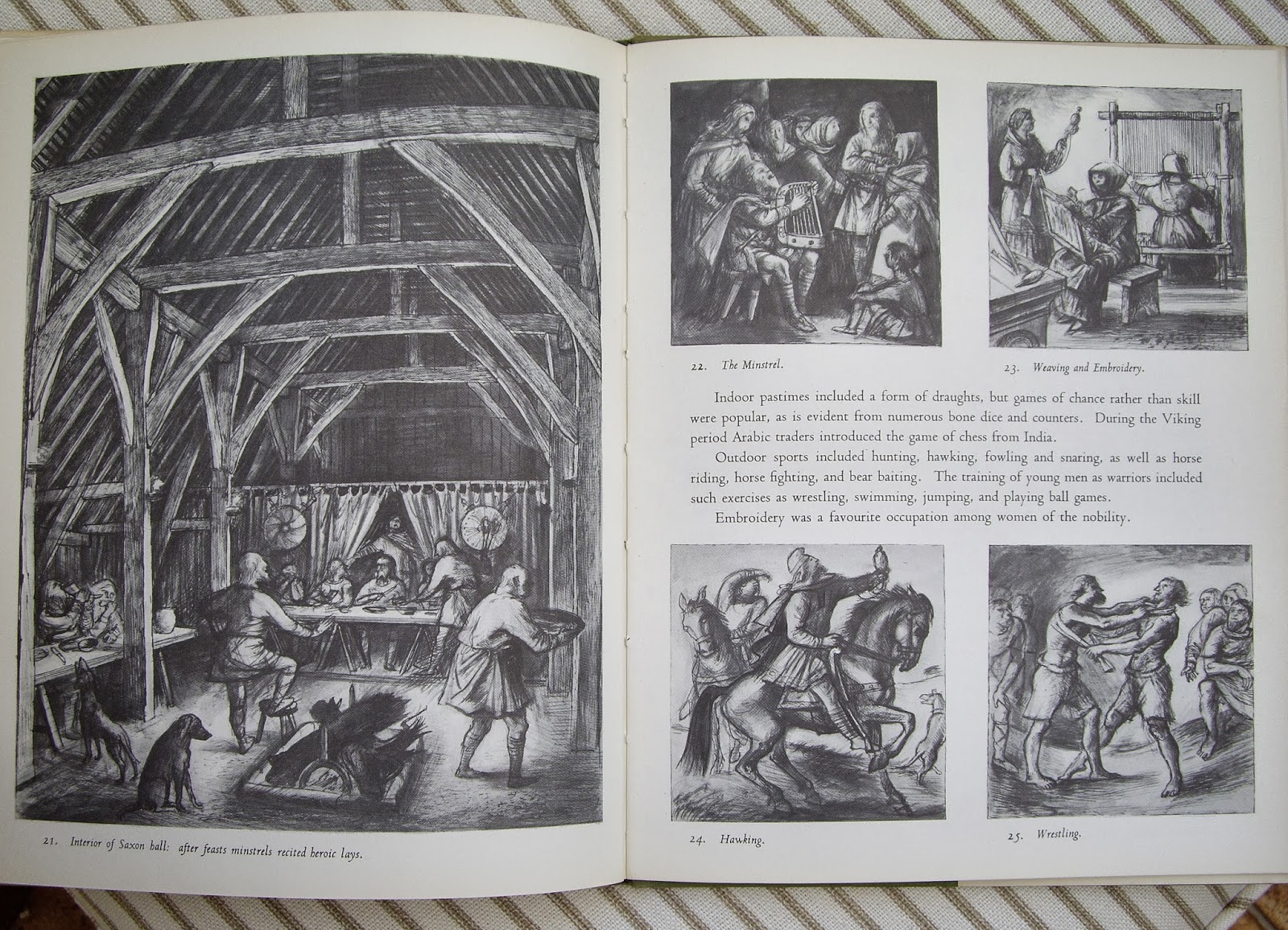
Alan Sorrell Part III 'Saxon England'

     I had made plans to write this post a few weeks ago, but my attention was diverted by clearing out my late Aunt's flat - an deeply emotional experience that is still sending out it's little ripples of sadness.
     So here, somewhat delayed, is the third in my occasional series on the work of the artist and illustrator Alan Sorrell.  This is an book in the series he illustrated for the Lutterworth Press.  His collaborator this time was the archaeologist John Hamilton.  The cover is certainly brighter than the one he drew for 'Roman Britain'.  There is something in the quality of both colour and drawing that reminds me of the work of Pauline Baynes (1922-2008) - the illustrator of, amongst other things, 'The Chronicles of Narnia' published by Geoffrey Bles.)  The most Neo-Romantic illustration is that of a Celtic monastery, a composition that seems to echo a lithograph by John Piper.  That brings me briefly on to the slightly unsuitable title, perhaps 'Dark Age Britain' would have been more appropriate for a book that covers all of these isles.


Sunday, 22 September 2013

Ely shopfront

     I spent a couple of days with the bf last week.  We found this old shop front undergoing restoration/redecoration in Fore Hill, Ely.  The lettering is rather lovely.  I wonder what lives are signified by it.  Apologies for the photography.  I was very tired: a sleepless night, a trip to Saffron Walden and the exquisite Fry Gallery, a trudge up from the station....


Saturday, 21 September 2013

St Michael, Langtoft

     It's over two weeks ago now that I went to St Michael, Langtoft.  The position of the church in relationship to the village is similar to Baston: both churches are parallel to the long village street.  Neither village has a green as such, but both main streets are broad, generous and straight and run north east; in the case of Baston it roughly follows the course of a Roman road that leads from King Street (aka Stoney Street) into the fens.  The same could be also be true of Langtoft.
     The church is grander than Baston, with an elegant broach spire, (the tower is almost detached from the building).  The south chapel is striking from the outside with its square-headed windows, (though obviously restored in the nineteenth century).  It contains some luxuriant, if somewhat clumsy, Decorated period carvings, and reminds me a little of the 'Golden Chapel' at St Mary's in Stamford. The church also contains some interesting later furnishings, including a matching pair of Baroque monuments.