So here I am with yet another vintage Habitat catalogue. This time from 1981. A rather jaunty cover, mainly blue and yellow, busier than before with just a smidge of vulgarity. The aesthetic has changed - more sharper and hard-edged, less homely. That change detected in the 1978 edition continues to grow. It could be said however that the covers are at variance with catalogue interior, which tells a slightly different story, in that it is more evenly balanced between the new hard style and the old 'humanism'. In fact, some of the images, say of the 'Arbour' bedroom range, look like they've been used in earlier editions, however the presence of a new wallpaper range 'Kandi' on the wall shows that the image was taken specifically for the 1981/2 edition. Habitat as evolutionary, and perhaps even conservative. As for the eclecticism of earlier catalogues, apart from the lighting, Art Deco Revival has disappeared, as have the Liberty prints, but the Laura Ashley inspired 'ditzy' print 'Tangleweed' remains. Brown is on the way out and there is an increase of bright primary colours and pastels, with mixed results. The best of the new fabrics is 'Fleur des Champs', but all the other new fabrics are discarded by the time of the 1985 catalogue. There are no Collier Campbell fabrics in this edition.
One of the delights of the Habitat catalogue are the little extras in the way of articles. This edition has four written by members of the Conran stable such as Stephen Bayley* (Bauhaus furniture), and Antonio Carluccio (Italian cooking). I guess, in a way, it makes Conran seem like Henri Gautier Villars.
One of the delights of the Habitat catalogue are the little extras in the way of articles. This edition has four written by members of the Conran stable such as Stephen Bayley* (Bauhaus furniture), and Antonio Carluccio (Italian cooking). I guess, in a way, it makes Conran seem like Henri Gautier Villars.
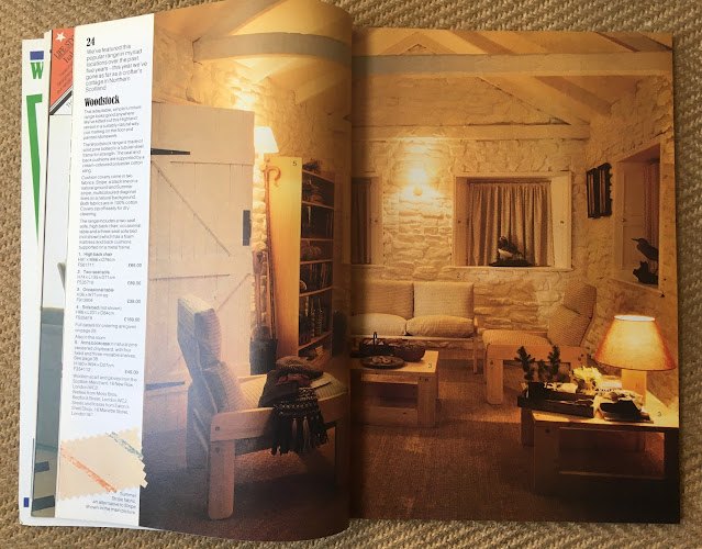
Several of the new style home sets, it has to be said, are really quite awful. The worst is the room created by Stafford Cliff; perhaps not bad in itself, but hardly domestic. More suitable for a commercial space. Born in Australia, Cliff, I should remind you at this point, had been the Art Director of the Habitat Catalogue for 10 years from 1971; this then could be either his final catalogue, or the first without him. I know that this is tantamount to heresy, but I'm that not that impressed with the room set designed by Terence Conran either. It just seems a bit tired. The work of a man with a busy schedule and little time to spare. But then, I suppose, Habitat seems to have quite the history of bad design**, in the same way it was quite good at simulacra. Anyway, the good....
** For example, pattern design, which, on what ever surface, was always a bit of a weakness.


No comments:
Post a Comment