Showing posts with label Habitat. Show all posts

Wednesday, 12 March 2025

The Habitat Catalogue VII: 1985

      What to say about this 1985 edition of the Habitat Catalogue that I haven't said before? It's probably not the worse, I suppose.  From what I've seen of it the 1982/3 edition is maybe a contender for that award, although 1988 is a strong runner.  Like the 1981/2 catalogue, which I reviewed last year, there does seem to a general aesthetic falling off.  This 1985 edition, I should point out, is the edition I mentioned in my post on 'English Style' by Suzanne Slesin & Stafford Cliff.

     As usual there are several Habitats on display.  To begin with there are the six templates, or looks, to be found in the introduction of Terence Conran's 'The House Book' of 1972.  For the uninitiated these six templates are: 'Country House', 'Farm House', 'Town House', 'Mediterranean', 'International', and 'Eclectic'.  That final category is, I suspect, less easy to define, or find.  It could, I suppose, be what you couldn't buy in Habitat.  The sort of things that made it seem that bit more liveable and interesting, and are that bit less prominent in this edition than hitherto.  
     Secondly there is the matter of style, for instance in this catalogue there is High Tec and 'Chic Graphique', and 'Neo-Victorian', but Art Deco, once prominent in the 1970s catalogues, has gone completely.
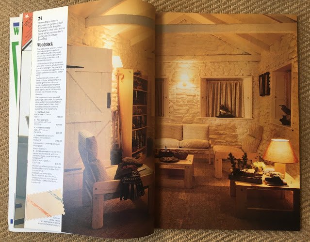
    Finally there is a third (as it were) typology at work in this catalogue.  Let me explain.  The major change - a major conceptual change, I think - was the introduction of the 'Habitat Country' range; furniture, fabrics and kitchenware, etc.  Some of it good some of it less so.  In many respects it was nothing new - it was, essentially, the 'Country House' and 'Farm House' templates combined and repackaged.  A victory, then, of style over substance?  Perhaps, yes. However, it is the first time in the Habitat catalogue when these categories have been made so explicitly distinct.  The contrast between 'Country' and the rest never so heightened.  It would be reductionist of me to present this as a simple choice between the bland and the rebarbative (see the Viby range below), simply because the aesthetics of the 1970s catalogues remain in places, but it wouldn't be wide of the mark.
     On to 'things', and the deeply covetable  Habitat Chesterfield was then still available.  As always seems to be the case the fabrics are particularly hit-and-miss. The best all seem to be designed by Collier Campbell; of the others the best are Fleurs des Champs and Jardin.
     Crockery is also hit-and-miss.  There are some excellent designs: Bianca, Petit Fleur, Kristina, Blue Copenhagen (also then available in pink) and 'Asiatic Pheasant' by Burleigh of Stoke-on-Trent; and there are some terrible ones: Quadra, Ribbon, Cerise, and Sandie.  Interestingly Old Colonial, a design from the 1950s produced by Adams, also of Stoke-on-Trent, was still available.  As always the glassware and kitchenware are pretty much spot on.


Tuesday, 1 October 2024

The Habitat Catalogue VI: 1988

      I had bought this, the 1988 edition of the Habitat catalogue, because I was looking for the Arts and Crafts fabric range that Habitat produced in that year in collaboration with the V&A.  The aptly named 'V&A Collection'.  I'm really intrigued by this collection (which also I have discovered, as of 7.10.24, also included ceramics) as it revived designs by Arts and Crafts masters such as C F A Voysey.  Images of these designs are available on the V&A website but information there and elsewhere is quite scarce.  There are any number of Habitat fabrics dating from 1988 on the museum website which therefore, I presume, formed part of the collaboration but only about half a dozen are obviously 'Arts and Crafts'.  If sales of second hand curtains on eBay are anything to go by, the designs 'Madura Tree' and 'Madura Leaf' were the most popular patterns.  The two Voysey fabrics, 'The House that Jack built' and 'Alice' both designed for children, included in the collection are almost as popular, but other designs such as 'Hemlock' are yet to appear.  Maybe the name was off putting.

     The first sentence I typed here when thinking about writing this post was: 'It is as though something has crawled into a corner and quietly died', and there is no ignoring the fact that looking through this catalogue in the days after it arrived was a disappointing experience.  Not only were the hoped for Arts and Crafts fabrics not featured, but something quite vital had indeed died.  Images too small, the submergence of everything in a gloop of sleekness.  Everything is bland and just a little corporate - I'm not sure whether this just a reflection of the wider culture, or of the internal machinations of the company. Then there is the absence of texture. Gone too are those little articles that, perhaps, set the Habitat catalogue apart from its competitors.  There is an almost unnerving sense of claustrophobia - the 1988 catalogue is a very introverted product caught up in its own 'materiality'; the room sets more enclosed, arid; there are less items on view that are unavailable to but at Habitat.  The items that suggested the life of owner of the room.  In addition all the photographs are far too small, and to be honest, I found it difficult to find suitable content to photograph for this blog.  Looking back at the distance of a fortnight, however, most telling thing, and not a first glance that noticeable, is the absence of the introductory letter from Terence Conran himself.  
     Since then I have somewhat modified my attitude.  The older Habitat is still there.  There are some good design to be found - lovely glass wear, cutlery and kitchenware.  There is a whole plethora of good fabrics designed by Collier Campbell, some of which may have been designed back in the 1970s.  Yet because of the design of the catalogue all these good things have to be actively searched for.

     (All the patterned fabric below is, I believe, by Collier Campbell.)


Monday, 16 September 2024

The Habitat Catalogue V: 1981/2

     So here I am with yet another vintage Habitat catalogue.  This time from 1981.  A rather jaunty cover, mainly blue and yellow, busier than before with just a smidge of vulgarity.  The aesthetic has changed - more sharper and hard-edged, less homely.  That change detected in the 1978 edition continues to grow.  It could be said however that the covers are at variance with catalogue interior, which tells a slightly different story, in that it is more evenly balanced between the new hard style and the old 'humanism'.  In fact some of the images, say of the 'Arbour' bedroom range, look like they've been used in earlier editions, however the presence of a new wallpaper range 'Kandi' on the wall shows that the image was taken specifically for the 1981/2 edition. Habitat as evolutionary, and perhaps even conservative.  As for the eclecticism of earlier catalogues, apart from the lighting, Art Deco Revival has disappeared, as have the Liberty prints, but the Laura Ashley inspired 'ditzy' print 'Tangleweed' remains.  Brown is on the way out and there is an increase of bright primary colours and pastels, with mixed results.  The best of the new fabrics is 'Fleur des Champs', but all of the other new fabrics are discarded by the time of the 1985 catalogue.  There are no Collier Campbell fabrics in this edition.
     One of the delights of the Habitat catalogue are the little extras in the way of articles.  This edition has four written by members of the Conran stable such as Stephen Bayley* (Bauhaus furniture), and Antonio Carluccio (Italian cooking).  I guess, in a way, it makes Conran seem like Henri Gautier Villars.
     Several of the new style home sets, it has to be said, are really quite awful. The worst is the room created by Stafford Cliff; perhaps not bad in itself, but hardly domestic.  More suitable for a commercial space. Born in Australia, Cliff, I should remind you at this point, had been the Art Director of the Habitat Catalogue for 10 years from 1971; this then could be either his final catalogue, or the first without him.  I know that this is tantamount to heresy, but I'm that not that impressed with the room set designed by Terence Conran either.  It just seems a bit tired.  The work of a man with a busy schedule and little time to spare. But then, I suppose, Habitat seems to have quite the history of bad design**, in the same way it was quite good at simulacra.  Anyway the good....


The bad....


 And the strange....


*  Described once as 'Robin to Conran's Batman'
** For example, pattern design, which, on what ever surface, was always a bit of a weakness.


Monday, 29 August 2022

The Habitat Catalogue IV: 1976


     Well, I have to admit that I've had this vintage Habitat catalogue for a while now, and only now have I got round to actually posting it. To be honest I found it a little bit of a disappointment when it arrived in the post, it being not quite as stylish as I had hoped. Anyway my collection of vintage Habitat catalogue quietly grows. Still there are some nice images - some of which were photographed at Terence Conran's own country house, Barton Court in Berkshire. I particularly like the Deco-ish sofa that graces the front cover.


Wednesday, 23 December 2015

The Habitat Catalogue III: 1978/79

      Back to another occasional series - vintage Habitat catalogues.  This one from the end of the 1970s.
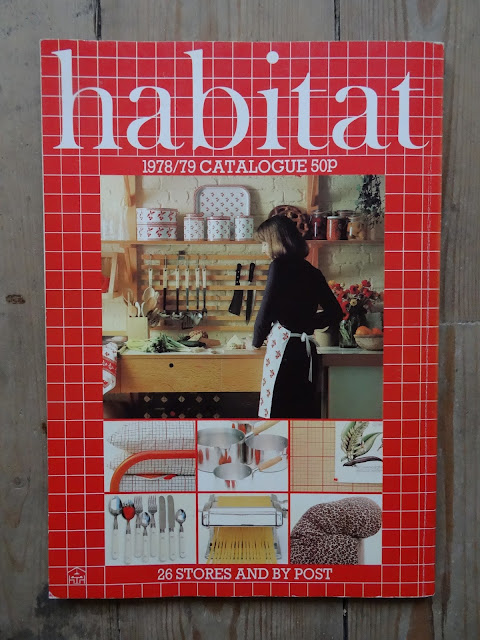
     The cover is meshed in 'Chic Graphique', and it marks a change in Habitat style.  The room set is altogether smoother and slicker than had been the case before.  There is still texture but it isn't quite so important. Glossier if you will.  I always think that Habitat was always slightly aloof from the slicker elements of Post War design. It did indeed take on board certain elements, such as the International Modern and Art Deco/Art Deco revival that could be described as 'slick', (as I said before Habitat was incredibly eclectic in its inspiration), but Habitat, for me, seemed to exist in that hinter land between the Arts & Crafts and that highly textured Modernism that came in with the Maison Jaoul (Le Corbusier, 1954-56).
     This cover image can be read as emblematic of a sea-change in general taste as interiors and objects have continued to grow (regrettably) sleeker, shinier and more generic still since then - and let's be honest duller and blander.  It's the difference, say, between Terence Conran's 'The House Book' of 1974 and 'The New House Book' of  1985.  This change can also be seen in an architectural work that was opened in the year of this catalogue, 1978, and has featured in this blog before, The Sainsbury's Centre for Visual Arts, at the University of East Anglia, Norwich.  There seems in general to have been a growing dislocation between the interior and its user; and the space, which is essentially private, has taken on some of the aspects of a public one.  There is a danger too, if it hasn't already happened, of the interior ceasing to be 'present' to its user.
     However some of the room sets in this catalogue still reflect that old and happier interest, such as the kitchen on the back cover.  I think colour and texture - pattern too - are due for a return.  I miss them.
     I love the graphic grid bedding - it's nice to see masculine bedding.  Reminds me of a tattershall check shirt. Oddly. Note also the splashy flowery design, the sort of thing that would become very popular, and that must owe something to Matisse.  What I haven't shown you is the Marimekko bedding on the next page which I hate.  Green with a thin white diagonal stripe. It has a harsh quality, that spawned far too many imitators.


It's still a small ambition to own a Chesterfield sofa.