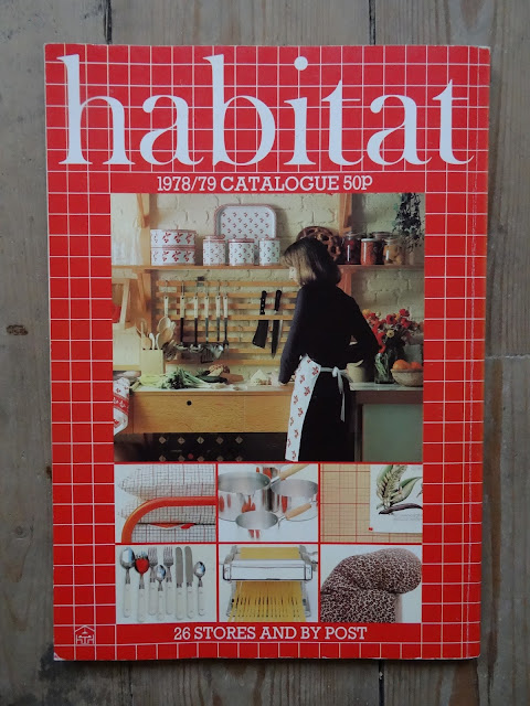
The cover is meshed in 'Chic Graphique', and it marks a change in Habitat style. The room set is altogether smoother and slicker than had been the case before. There is still texture but it isn't quite so important. Glossier if you will. I always think that Habitat was always slightly aloof from the slicker elements of Post War design. It did indeed take on board certain elements, such as the International Modern and Art Deco/Art Deco revival that could be described as 'slick', (as I said before Habitat was incredibly eclectic in its inspiration), but Habitat, for me, seemed to exist in that hinter land between the Arts & Crafts and that highly textured Modernism that came in with the Maison Jaoul (Le Corbusier, 1954-56).
This cover image can be read as emblematic of a sea-change in general taste as interiors and objects have continued to grow (regrettably) sleeker, shinier and more generic still since then - and let's be honest duller and blander. It's the difference, say, between Terence Conran's 'The House Book' of 1974 and 'The New House Book' of 1985. This change can also be seen in an architectural work that was opened in the year of this catalogue, 1978, and has featured in this blog before, The Sainsbury's Centre for Visual Arts, at the University of East Anglia, Norwich. There seems in general to have been a growing dislocation between the interior and its user; and the space, which is essentially private, has taken on some of the aspects of a public one. There is a danger too, if it hasn't already happened, of the interior ceasing to be 'present' to its user.
However some of the room sets in this catalogue still reflect that old and happier interest, such as the kitchen on the back cover. I think colour and texture - pattern too - are due for a return. I miss them.
I love the graphic grid bedding - it's nice to see masculine bedding. Reminds me of a tattershall check shirt. Oddly. Note also the splashy flowery design, the sort of thing that would become very popular, and that must owe something to Matisse. What I haven't shown you is the Marimekko bedding on the next page which I hate. Green with a thin white diagonal stripe. It has a harsh quality, that spawned far too many imitators.
It's still a small ambition to own a Chesterfield sofa.


No comments:
Post a Comment